AI Art (Premium)
- Paul Thurrott
- Apr 30, 2023
-
7
Like many of you, I’m experimenting to see where it makes the most sense to introduce AI into my workflows. But I have little interest in using AI for writing, and so I have started, instead, with AI-based graphics for logos and other brand assets, and for “hero” images on this website.
It started, sort of, one year ago, when my wife and I started a YouTube channel called Eternal Spring, triggering evaluations of apps and services with which I was unfamiliar. Key among these, of course, was a video editor, and I eventually settled on Adobe Premiere Elements, which has worked out well. But perhaps less obviously, there was also a need for a solution that I could use to create logos and other graphical assets.
And here, I was less successful, though I did eventually find two decent services, Canva, and Adobe Express, the latter of which was first announced in December 2021. Most of my early work on the channel graphics involved coming up with some form of large format logo as well as a smaller logo that I hoped to eventually put in the corner of videos like a watermark. Frustrated by some combination of my inexperience and the tools themselves, I created the initial graphics much as I do with everything else graphics-related, with some combination of Microsoft Paint and Adobe Photoshop Elements. (I create my family’s Christmas card this way each year, for example. And I wrote about my frustration with Microsoft making Paint work more poorly in Windows 11.)
But where to start?
I like minimalist designs, and I was inspired by the titles for Killing Eve, which wrapped up its fourth and final season just as I was working up my own graphics. The title sequence for the show involves a tall, stretched font, a different color background each week that complements the color of the text, an animated blood trail that appears in one of a few different places each week, and different music each week. I didn’t want the animation bit, but I liked the stretched font and the color variations and so I worked up something like that. At the time, I was using Affinity Photo, not Photoshop Elements, so the logo, which became the video title sequence, was worked up with that app.
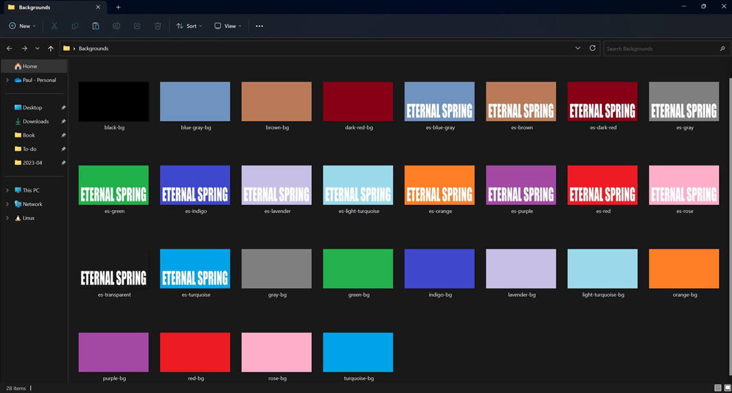
The Microsoft fans in the audience will be delighted to know that the 14 background colors I chose are among the 20 stock colors provided in the Colors section of the Microsoft Paint ribbon. And I went with white for the text/logo, instead of a different color as with Killing Eve, though I’d still like to change that. I also moved the text/logo to the bottom of the image, which I prefer, from the middle, and I chose a different font, which I then stretched vertically to get the effect I was looking for.
I also created a version of this logo with an image mask in the background of each letter, initially a photo I took of the Mexico City skyline. I used this for the website for the channel, which we barely update, and for the channel’s page on YouTube.

But I still needed a smaller logo, not just for a watermark but also something I could use for the profile image for the YouTube channel. I tried and failed to create that with Canva, but I had better luck with Adobe Express, which gave me the basic idea of the two letters, ES, separated by a vertical line. I edited that and used one of these designs for the first several months as the channel’s profile image.
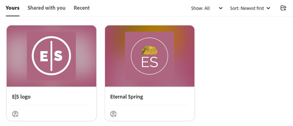
To be clear, we went with the left one, as the fun little taco image seemed a bit off, especially given that tacos don’t look like that in Mexico: that’s an American hard-shelled taco.
But that image always bugged me. I didn’t like the color, for starters, and had wanted something that was purple like the flowering Jacaranda trees that are all over Mexico City. And I didn’t want to use it as a watermark because I knew I’d be replacing it, and I didn’t want that logo there if it was temporary.
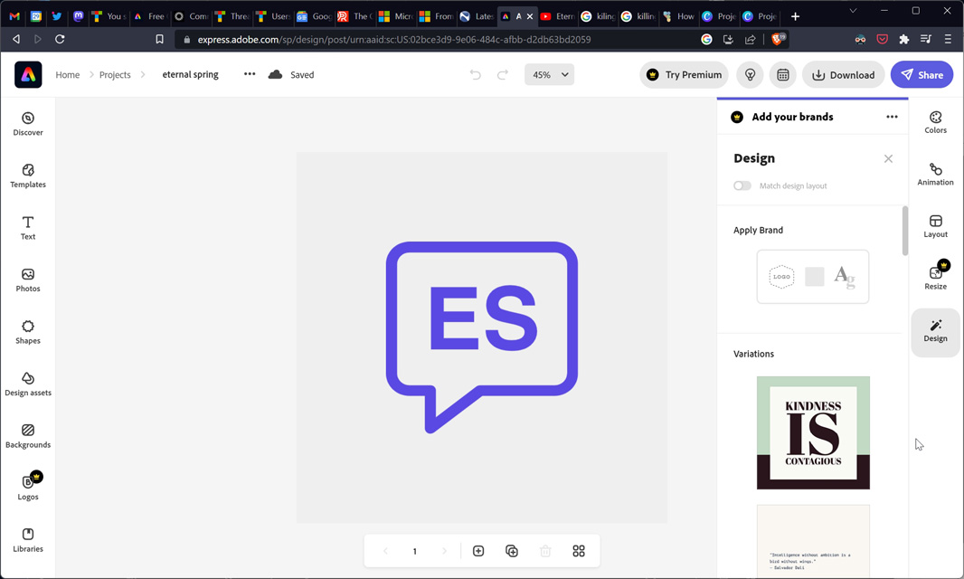
Every so often, I’d revisit this, but I eventually came up with something, again in Adobe Express, that was closer to what I was looking for. Here, again, I started with a logo design provided by the service.
I took this basic design, edited it, and exported it, and came up with the final design using, yep, Paint and Photoshop Elements. This update includes the text “CDMX” (for Ciudad de Mexico, or Mexico City) using a lighter variation of the purple used elsewhere in the image that is a) based on the two-color Killing Eve thing noted above, and b) was color-picked from an image of a Jacaranda flower.

I then used that to create an overlay that we use as a watermark-type thing in the lower-right corner of our videos. At this time, I also changed the larger channel/website logo to use a DALL-E-created image for the background mask. (This was done in Photoshop Elements.)
![]()
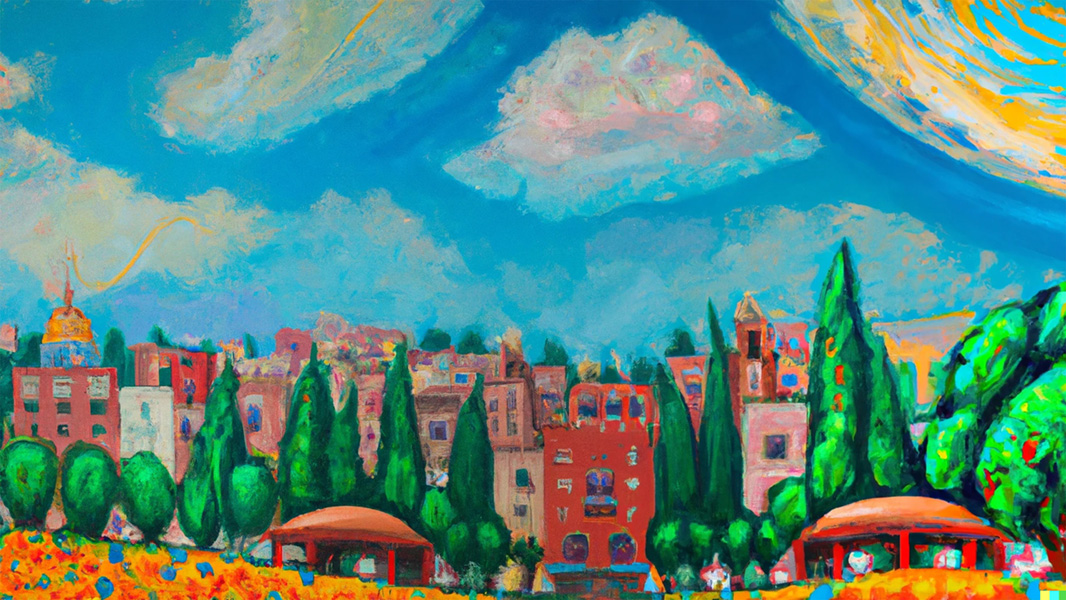
DALL-E was one of my earliest experiments with AI, but it was also one of my most successful, and I so also used this service to experiment with cover designs for my most recent books, the Windows 11 Field Guide and Windows Everywhere, and I think it’s fair to say that while none of those experiments led to a final cover design, they did influence and inspire the designs I eventually came up with. Anyway, the seed query for the background image I did select for Eternal Spring was “impressionist oil painting of Mexico City.”
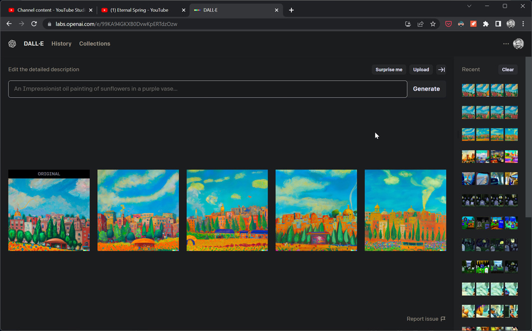
Moving over to Thurrott.com, I’ve been thinking about the value of using DALL-E and similar services to create unique artwork for article “hero” images, the pictures that appear at the top of most articles and as their thumbnail image on the home page and other site pages. This may not be obvious to some, but as a publisher, we are at risk legally if we use an image that is copyrighted or otherwise legally protected. And there are bad actors out there who try to sue sites like mine for using images either mistakenly or, as is more often the case, were licensed at one point by a company like Microsoft. Anyone who does what I do believes that any Microsoft-published imagery is OK to use in an article we publish because it’s fair use. Which, of course, it is.
One way to avoid legal issues now is to use services like Unsplash or Pixabay that provide freely-licensable or cheaply-licensable content. And that works out fine, but it’s also likely that an image you find on such a service will be used elsewhere too, of course, and perhaps broadly. And so the use of AI-created images is quite compelling: these images would (ideally) be risk-free legally and would also be unique, meaning that if one of these images pops up on some other site, then I’ll know they stole it from me. This is particularly useful, I think, for images that would appear on Premium articles.
And so I began experimenting with that as well. So far, I’ve not done anything photographically realistic, but have instead stuck with impressionistic, painting-like images. Here are three recent examples:
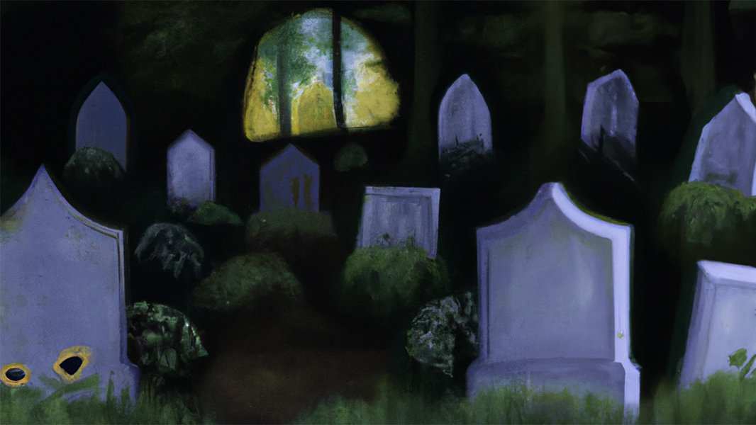
Where Windows App Development Goes to Die (Premium)
Starter phrase: “an oil painting of a scary graveyard with a microsoft windows logo on one grave”
It wouldn’t use a Microsoft logo, so I just edited out the “M” it put on a few graves
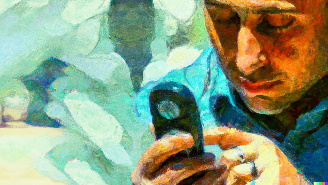
This is a Tough Year to Bet on Ecosystems (Premium)
Starter phrase: “impressionist oil painting of a man relying on a digital assistant”
This one had to go through several variation generations until I got something I liked

Podcasts Are Not Music (Premium)
Starter phrase: “music fills the world with love”
The images I got from this one initially were all over the place and did include some photorealistic options, but I like the image that led to the final variation choice
It is perhaps worth noting that when Microsoft announced Designer in October 2022, I was of course interested, and while my initial impression wasn’t all that positive, it was an early preview, so I wasn’t too concerned. But now that the product is available in a broader preview and Microsoft is heavily promoting its use of AI, I thought I should take another look.
And what I see there is pretty lackluster, though I will caveat that by noting that I have tested the service using some very specific queries that basically mimic the way I experimented with Canva and Adobe Express in the past. And from what I can see, the makers of those two services have little to worry about.
Microsoft Designer takes the basic text-to-asset creation capability from DALL-E and integrates it directly into the product, much as Microsoft has done with the image creation capabilities in the Bing chatbot or the Microsoft Edge sidebar. In other words, this is one of a few different ways in which you can come up with logos and other brand imagery that you might use on the web, social media, YouTube, and elsewhere.
And … It hasn’t worked well for me, at least so far. When I prompted it explicitly for a purple logo design of whatever kind, for example, most of the results were not purple and/or contained no purple color.
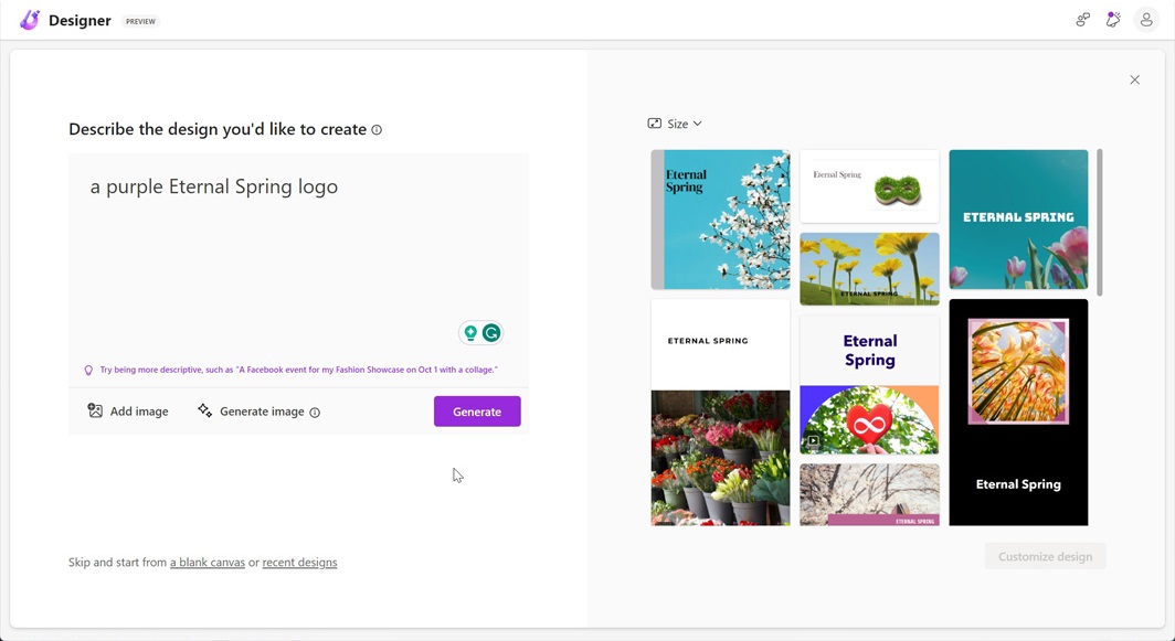
Frustrated by that, I then tried the prompt I used with DALL-E to create the background image I use for the Eternal Spring logo (“impressionist oil painting of Mexico City “). And I was curious to see that the designs were basically the same style as before regardless of how I worded it. Certainly, none were in the style (“oil painting”) I had asked for. And some of the images were from places not in Mexico City, for crying out loud.
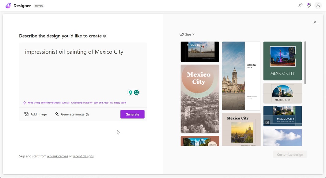
I can’t say that Microsoft Designer shows the limits of AI given the success I’ve had elsewhere. But it is perhaps a good example of the limits of AI in Microsoft’s products and services. And maybe a warning that Microsoft’s idea of introducing AI-powered copilot functionality throughout Microsoft 365 won’t be an immediate success.
We’ll see. For now, we have plenty of examples of how AI can create stunning imagery, and I’m probably going to look at creating photorealistic images with AI soon as well. It is still very early days for this capability.

Gain unlimited access to Premium articles.
With technology shaping our everyday lives, how could we not dig deeper?
Thurrott Premium delivers an honest and thorough perspective about the technologies we use and rely on everyday. Discover deeper content as a Premium member.