Google to Introduce Updated News Interface for Search

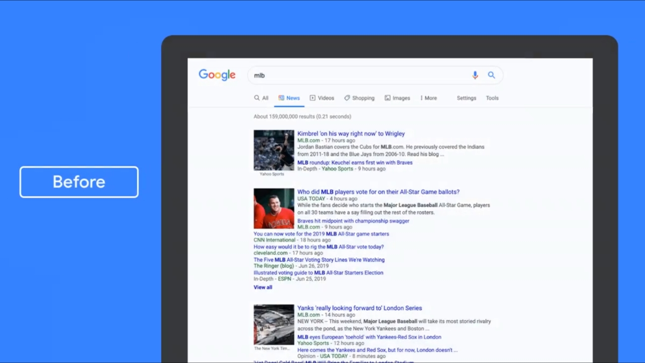
Google is making another big change to the Search interface on desktop this year. The company introduced Material Design icons for parts of the search UI in June, and it’s now starting to roll out a new look for News on Search.

The company announced on Twitter that it’s rolling out a refreshed design over the next couple weeks. The new design makes publisher names more prominent and introduces a much better interface that’s organized better.

Windows Intelligence In Your Inbox

Sign up for our new free newsletter to get three time-saving tips each Friday — and get free copies of Paul Thurrott's Windows 11 and Windows 10 Field Guides (normally $9.99) as a special welcome gift!

"*" indicates required fields

This field is for validation purposes and should be left unchanged.

You can see the new interface below, and it does seem like a really good upgrade in terms of the design. There’s a grid of items with the top news, followed by individual cards for stories from publishers. Right now, the results are separated into different sections and it’s frankly quite cluttered, but the new interface addresses that issues by introducing independent cards that allow News to emphasize the publisher name.

It’s not clear if the new interface for News will affect traffic for news publishers, but considering that each story now takes up more space, less popular publishers could start seeing their stories appear slightly lower on the results. From a user’s perspective, though, I’d say the upgrade is really good as it takes out a lot of the clutter and organizes things much better.
Tagged with

Share post

Please check our Community Guidelines before commenting

Conversation 5 comments

  • mattbg

    Premium Member
    12 July, 2019 - 8:58 am

    <p>I started seeing this new design about a month ago.</p><p><br></p><p>With the publisher logos, it looks a lot more like Apple News. This seems trivial, but it's not. Having the source of the news be prominent is important.</p><p><br></p><p>Combined with AMP, some of the other aspects of Apple News are present as well, and obviously this is cross-platform where Apple News is not.</p><p><br></p><p>So Apple News+ might as well call themselves Apple Magazines at this point. Publishers are apparently not happy with the News+ arrangement after running with it for a few months, and I can't imagine this is any better, especially with AMP in between the user and the content.</p><p><br></p><p>I subscribe to News+ because of the clean interface and because of the possibility of paying publishers in some way while having access to a variety of sources. If publishers are not happy, and if the app has not improved much if at all since launch (it really did need to be improved), I'm not sure I will subscribe for much longer.</p>

  • rm

    12 July, 2019 - 9:51 am

    <p>Interesting, it looks a lot better, it also looks a lot like Bing has looked for some time.</p>

  • Thom77

    12 July, 2019 - 12:47 pm

    <p>"<span style="color: rgb(0, 0, 0);">&nbsp;but considering that each story now takes up more space, less popular publishers could start seeing their stories appear slightly lower on the results.&nbsp;"</span></p><p><br></p><p><span style="color: rgb(0, 0, 0);">you dont say ….</span></p><p><br></p><p><span style="color: rgb(0, 0, 0);"> and just in time for the next Presidential cycle where real news from official news sources that gave us weapons of mass destruction, children in incubators, fireproof passports, and Russiahoax, get top tier status on search results, while celebrating and pushing war agendas because war is good for business.</span></p><p><br></p><p>Alternative conservative news outlets and anti war left and right outlets will be buried even further down the list then they already are.</p><p><br></p><p><br></p><p>But hey …. it looks better.</p><p><br></p><p><span style="color: rgb(0, 0, 0);"> </span></p>

  • mikes_infl

    12 July, 2019 - 1:05 pm

    <p>I hope they implement site filters similar to their "assistant" on Android. It's annoying having to keep adding search operators to the address bar ( or omnibar or whatever it's called by now ).</p>

  • mhsajidsifat

    26 October, 2019 - 12:25 pm

    <p>Wow, this article is very good. it was really helpful for me. </p>

Windows Intelligence In Your Inbox

Sign up for our new free newsletter to get three time-saving tips each Friday

"*" indicates required fields

This field is for validation purposes and should be left unchanged.

Thurrott © 2024 Thurrott LLC