Google Assistant’s New Dark Mode Cards Look Horrible

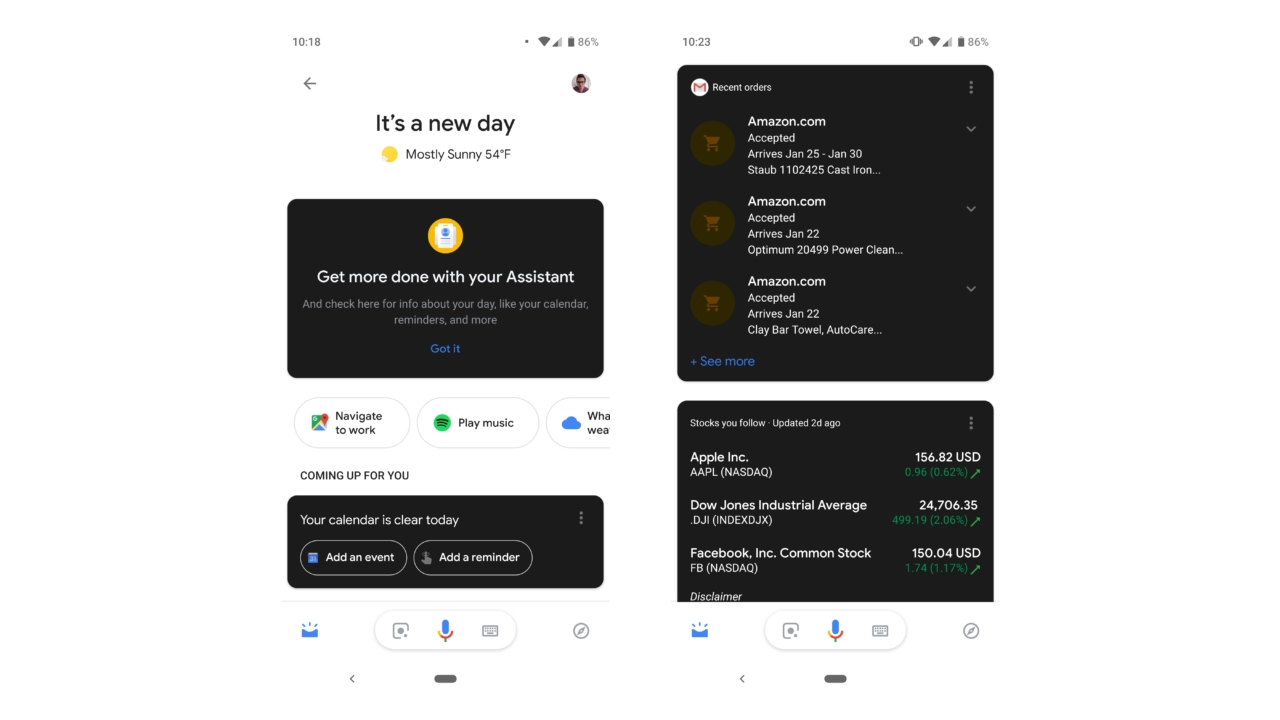
Google is rolling out new dark mode cards for Google Assistant on Android. The company is testing a new feature that allows users to display the Assistant cards with a dark mode, but it looks absolutely terrible.

As Android Police reports, the new dark mode is literally a combination of light and dark. The cards are dark, but the UI itself continues to be light. Both combined, you have a product that looks half finished and simply ugly.

Windows Intelligence In Your Inbox

Sign up for our new free newsletter to get three time-saving tips each Friday — and get free copies of Paul Thurrott's Windows 11 and Windows 10 Field Guides (normally $9.99) as a special welcome gift!

"*" indicates required fields

This field is for validation purposes and should be left unchanged.

It’s not clear if Google is rolling this feature out widely to everyone, or whether it will get pulled. The company is reportedly working on a system-wide dark mode for Android with the next major upgrade, and improvements to this current version of the dark mode Assistant could tie in nicely with that. For now, though, it’s just a mess.

Tagged with

Share post

Please check our Community Guidelines before commenting

Conversation 12 comments

  • dcdevito

    21 January, 2019 - 3:20 pm

    <p>This is the beta version of the app, sometimes beta is ugly. Nothing to see here </p>

  • ReformedCtrlZ

    Premium Member
    21 January, 2019 - 3:24 pm

    <p>I saw this roll out over the weekend. In practice it doesn't look terrible, but its obviously jarring. I'll take any step away from pure white elements. I just hope the replace the rest of the UI soon :)</p>

  • CaedenV

    21 January, 2019 - 4:45 pm

    <p>Why is it so hard to get dark mode right? Google, MS, Apple… everybody seems to get it wrong. Dark mode means dark. Not high contrast. It doesn't even have to be black. Just something easy on the eyes when in a dark room.</p>

    • Jason Peter

      21 January, 2019 - 5:26 pm

      <p><a href="#398540"><em>In reply to CaedenV:</em></a><em> "</em>Google, MS, Apple… everybody seems to get it wrong."</p><p><br></p><p>Whats wrong with MacOS Mojave’s implementation of dark mode? </p><p><br></p><p>While certainly not perfect (most 3rd-party apps have to be updated to use the new API), it is the most polished implementation that I have seen in a modern OS. Its not too harsh (uses muted tones when necessary rather than just extreme black/white), and is much more consistent OS-wide (unlike the unfinished &amp; unusable disaster that Windows 10 dark mode turned out to be…).</p><p><br></p><p>I certainly can’t agree that they didn’t get it right, especially on the first pass. </p><p><br></p><p>"Not high contrast. It doesn't even have to be black. Just something easy on the eyes when in a dark room."</p><p><br></p><p>Which is essentially Mojave, which for the most part is differing tones of dark gray, rather than stark-black contrast. </p><p>The only content that is going to be hard on the eyes in this mode are white/light content from webpages or photos. And Safari reader mode can be configured to automatically have a dark mode background if needed. Otherwise, the OS is not responsible for muting content that was designed to be white in the first place, such as webpages, etc.</p>

    • jimchamplin

      Premium Member
      21 January, 2019 - 8:17 pm

      <blockquote><em><a href="#398540">In reply to CaedenV:</a></em></blockquote><p>The admittedly bare bones Adiwaita theme for the GNOME desktop also has an excellent dark variation. Like Mojave, it’s various grays.</p>

  • nicholas_kathrein

    21 January, 2019 - 4:50 pm

    <p>This is a short term issue as for Google Pixel users. I'm not sure how long it will take the rest of the OEMs to have dark mode on their phones but some point this year this will be a non issue for some. </p>

  • harrymyhre

    Premium Member
    21 January, 2019 - 5:02 pm

    <p>This is amusing for me. </p><p>In the "olden days" computer screens were black background with green letters, or sometimes brown letters. </p><p><br></p><p>Then the Mac was released and all backgrounds were changed to white with black letters. </p><p><br></p><p>Now most of the people who remember green screens are gone, so somebody had the brilliant idea to revert to green screens /dark mode. </p><p><br></p><p>Hilarious ?</p>

    • Daekar

      21 January, 2019 - 8:52 pm

      <blockquote><em><a href="#398542">In reply to Harrymyhre:</a></em></blockquote><p>Agreed! I use a SwiftKey theme that is precisely that green on black, and I love the aesthetic even all these years later. </p>

    • karlinhigh

      Premium Member
      22 January, 2019 - 9:13 am

      <blockquote><em><a href="#398542">In reply to Harrymyhre:</a></em></blockquote><p>The look is in style twice without having changed.</p>

  • cmdrkeene

    21 January, 2019 - 5:47 pm

    <p>Windows 3 until Windows 7 would let you turn off the aero effect skins and set your own color palette used on surfaces. "Rainy Day" was my theme of choice with a dark gray "night mode-like" color scheme.</p><p>They took away the ability, and now they're really doing a darn poor job of implementing the replacement.</p>

  • dontbe evil

    22 January, 2019 - 12:41 am

    <p>of course the article is not from the google fanboy paul</p>

  • Bats

    22 January, 2019 - 10:51 am

    <p>Soooooooo….I take it that it's not gorgeous (lol)?</p>

Windows Intelligence In Your Inbox

Sign up for our new free newsletter to get three time-saving tips each Friday

"*" indicates required fields

This field is for validation purposes and should be left unchanged.

Thurrott © 2024 Thurrott LLC