In Praise of Samsung One UI 7 (Premium)
- Paul Thurrott
- May 11, 2025
-
20
I’m critical of the superfluous apps and services duplication and other clutter that Samsung brings to its Android devices because it’s terrible and an obvious example of enshittification that puts the company’s strategic needs ahead of providing customers with the best possible user experience. But like most things in life, there’s a more nuanced story here, too, and some of the additions that Samsung makes to Android are thoughtful and useful.
Whether the pros outweigh the cons is up to the individual–our needs all vary–but I would like to highlight some key things that Samsung gets right with One UI 7, the latest version of the highly customized user interface that it puts on Android 15. This is the system that Samsung bundles with its latest Galaxy S25 products, like the Galaxy S25+ I’ve been using for about a week. And it’s rolling out now to supported previous-generation Galaxy devices, too. For example, my wife got this upgrade on her Galaxy S24 Ultra a few weeks ago.
Pinning down where Android ends and One UI begins is sometimes difficult. Many refer to One UI as a “skin” on top of Android, while Samsung describes it as “innovative software” that’s unique to its devices and “powers your smartphone and tablet in addition to the Android operating system” and is “integral to the Samsung Galaxy experience.” From what I can tell, it’s no different from the highly customized Android that Google ships on its Pixel devices. There’s a lot extra in there, all of which builds on top of a stock Android that almost none of us ever experience, usually–maybe, hopefully–for the better.
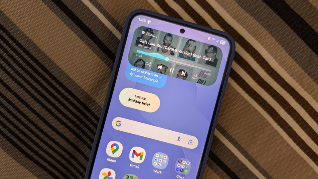
One UI 7 introduces what Samsung calls a “comprehensive redesign” with a “fresh aesthetic” and intelligent features that adapt to how you use your device.” It’s refined, more intuitive, and provides advanced AI integration. According to Samsung, key new features include the Now Bar, (more) Google Gemini advances, AI Select (which brings multiple AI features like Writing Assist, Auto Trim, Photo enhancements, Drawing Assist, and so on to the apps where they are needed), and various Settings improvements.
And, yes, these things are all present. But I feel like Samsung is downplaying a few features that I find to be more useful than anything listed above. And based on what I know about the work Google is doing with Android 16, the next version of this OS that we believe it will formally finalize next week at its Android Show: I/O Edition Livestream in two days, it’s clear that Google is working hand-in-hand with its biggest partner on some new platform features. I noted some of this in a recent story about hidden new features in Android 16. But there’s more.
Here, I’ll focus on the most obvious–and most welcome–of these features, called Live notifications. Like much of what Samsung does, this feature was, ahem, inspired by an iOS feature I love called Dynamic Island. And in keeping with the commentary above about the Google/Samsung partnership, this feature is coming to Android 16 as Live updates, a new class of notifications for ongoing activities like ride-sharing, deliveries, and navigation called progress-centric notifications.
This is a good idea. Even if you’re cynical about Samsung’s ongoing copying of everything Apple does, we should agree that it’s an idea worth copying. Which absolutely explains why both Samsung and Google jumped all over this. Put simply, this feature–Live notifications in One UI 7, soon to be Live updates in Android 16–is Dynamic Island for Android. Here, I will stick to the current Samsung implementation, but I suspect that will evolve (in One UI 8) as Google completes Android 16.
Some examples will help explain why this feature is so good.
The other day, I drove into New York City for a meeting. This is time-consuming, and tedious, and my current strategy is to drive to the train station in Secaucus, New Jersey, which takes 90 minutes on an ideal day with little traffic, or two or more hours otherwise, and then take a NJ Transit train into the city from there. If I’m just going to Penn Station, this can be very quick. But in this case, I had to go to One World Trade in southern Manhattan, so I also had to take a subway from Penn Station to get there. Door-to-door, this was a three-hour trip heading into the city, but when I came home in the early, it was “only” 2 hours and 20 minutes or so. Yes, I spent almost 5 and a half hours in my car and various trains so I could spend less than an hour in an an-person meeting.
During the drive, I connected my Galaxy S25+ to a USB cable for power and used Google Maps for navigation. But I also wanted to listen to something–what doesn’t matter per se, but it could be music (YouTube Music), a podcast (Pocket Casts), or an audiobook (Audible) depending on my mood–and so I would be switching between apps, while driving, and while trying to navigate. This is a pain for all the obvious reasons, but it can also be dangerous, since I’m driving and need to pay attention to the road.
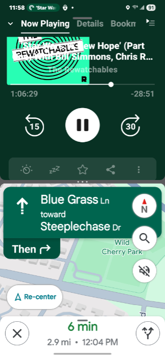
I had seen the subtle, color-based indication that an app can display a live notification before, but didn’t think too much of it. But in the case, I started playing a podcast in Pocket Casts and then switched to the Home screen or Google Maps. When I did, a color display appeared in the upper left of the screen, in the status bar. Here, it’s green because the podcast I was listening to has a green logo, and you can see the Pocket Casts logo and some animated text for the episode title.
I couldn’t see most of that in the car: The phone was two or more feet from my head, I was driving, and that display is tiny. But I could see the color and, I guess, the animation. And with Google Maps running normally–meaning full-screen–and at some point, I needed to make a change to the media playback. Perhaps the episode I was listening to concluded, it doesn’t matter. The first time I did that, I did it in the traditional way, by switching to Pocket Casts and figuring out what to play next. And as I did that, Google Maps appeared in an always-on-top picture-in-picture (PiP) window. That little window is interesting for various reasons, but we’ll get back to that.
So that works. It’s not ideal, but I could switch between the two apps and I didn’t drive into another car or off the road, so I guess it was OK. But at some point, the little green notification in the status bar caught my attention. And so I tapped it. And what appeared was something very much like Dynamic Island, a live notification for Pocket Casts with media playback controls.
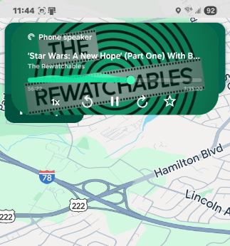
When the live notification is on-screen, it has the focus. So if I were to tap in Google Maps, the live notification would disappear. But this notification, which is identical but colored differently for other media apps, is useful. I could use it to change the playback–skip over an ad in a podcast, skip to a new song in YouTube Music, etc.–without leaving Google Maps.
To be clear, that’s important. When you switch out of Google Maps and that little PiP window appears, it’s hard to get that app back into a full-screen display. And that’s especially true when you’re driving, because all the hit points are so small. The window itself is small. There are no UI controls by default: You tap it once to display them, and the PiP window gets a bit bigger at that moment. But if you don’t tap anything immediately, the UI-less PiP window view returns. This window can display four tiny icons–Settings, Split screen, Full-screen, and Close–and they’re hard to see and tap when driving. It’s doable but you have to be more precise than is sometimes possible.
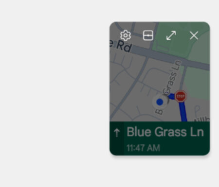
So, not leaving Google Maps is an improvement. I could tap that little status bar-based notification reasonably easily, do what I needed to do with the playback controls, and then keep driving, without having to switch apps. A bigger improvement would be displaying Pocket Casts (or whatever) and Google Maps on-screen at the same time. On my Pixel, this isn’t possible, at least in any obvious way. But as noted above, the Google Maps PiP window has a Split screen button on the Galaxy S25+. And that lets you use two apps side-by-side on-screen at the time same time. (Or stacked top-to-bottom if the phone is in portrait mode.)
There are probably a few ways to set this up, but I had the best results by switching to Pocket Casts (or whatever) and then tapping the Split screen button in the Maps PiP window. By default, it places the two most recent apps on-screen, with 50 percent of the screen allotted to each.
But you can use the slider in the middle to resize each app, and I used this to give Maps about 75 percent of the screen and the other app the remaining 25 percent.
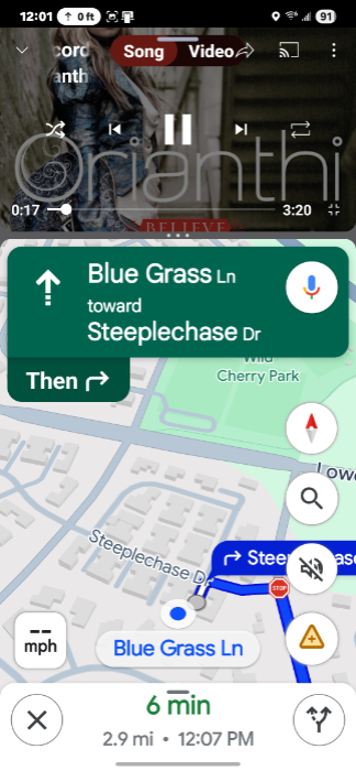
Some apps handle this better than others. For example, in this configuration, YouTube Music more closely emulates its live notification display (as seen in the Notifications shade pull-down and, on Pixel, at least, the Lock screen; One UI 7 does something a bit different on the Lock screen, as noted below). But whatever. This was a useful way to navigate using a display that was big enough while still being able to handle media playback without constantly switching apps. While driving, which, again, can be dangerous.
So that’s nice. Regarding the Lock screen display, this didn’t apply while I was driving, but One UI 7 displays live notifications there uniquely as well. For media apps, you get a small playback control with Back, Play/Pause, and Forward buttons only.
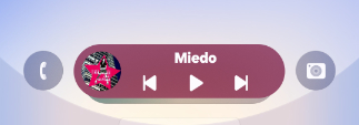
But you can also switch between multiple live notifications on the Lock screen if present: Just swipe up on the live notification to see the one below it. In this case, I also had Google Maps in there because I was taking screenshots of all this while recreating what I’d seen in the car last week.

Live notifications–like Dynamic Island on the iPhone–can be useful in all kinds of situations. My biggest use case is actually Uber, and it’s good for keeping track of a car before it arrives and then on your progress when you’re en route. Airline apps are another good example, but also any delivery situations like Amazon, FedEx, or whatever.
Granted, not all of Samsung’s ideas are clear winners, though here, too, opinions will vary. For example, One UI 7 also copies iOS in the way that the Notifications shade and Quick settings (on iOS, Control Center) UIs are separate and accessed separately: You swipe down from the top left of the screen to see the Notification shade and swipe down from the top right of the screen to see Quick settings. On Android, this is a single user interface, and you can swipe down from any part of the screen to see it.
But, this is Samsung. And if there’s one thing Samsung does pretty consistently, it’s give you options. And sure enough, there’s a way to switch back to a single interface for both notifications and Quick settings, with the familiar universal swipe down gesture. And good luck finding that, because one of the downsides to all the choices Samsung gives you is that there are a ton of options to stumble into. Clutter, one might say. But also choice. And choice is good. Usually.
(If you do want to customize this feature, open Quick settings and tap “Panel settings” in the top left.)
When I first got the Samsung Galaxy S25+, I was surprised by how much I liked the device. There’s a lot that goes into that, of course. The screen is gorgeous. The phone is noticeably thinner and lighter than the Pixel 9 Pro XL and iPhone 16 Pro Max. I figured I was really going to like One UI, mostly for the look and feel, and I even find the squircle shape of its icons to be pleasant. But there are niceties hiding all over One UI 7, and this live notification feature is among the best of them, maybe the best. It’s not a reason to switch phones, but it is something that many customers who do go this route will love. It’s worth pointing out, for sure.
There’s so much else going on with the Galaxy S25+ and One UI 7. I haven’t even touched on the photos experience, which has been very good so far. But I wanted to at least acknowledge some of the good work that Samsung has done, given my ongoing criticisms of this company and the bloat it also adds to its devices. Not everything it does is terrible. Indeed, some of this work is quite special.

Gain unlimited access to Premium articles.
With technology shaping our everyday lives, how could we not dig deeper?
Thurrott Premium delivers an honest and thorough perspective about the technologies we use and rely on everyday. Discover deeper content as a Premium member.