Windows 11 Feature Focus: Quick Settings and Notifications

Windows 10 featured an Action Center interface that combined quick actions and notifications into a single place. But Windows 11 is different. Now, we have separate and more useful Quick Settings and Notifications interfaces. And a new keyboard shortcut to learn.

Before describing what’s new in Windows 11, let’s take a look back at the Windows 10 Action Center as well as the Chrome OS Quick Setting interface, which is an obvious inspiration for the changes in Windows 11.

Windows 10

As I explain in the Windows 10 Field Guide, the right-most part of the default taskbar is called the notification area. It provides status icons for News and interests, Meet Now, OneDrive, networking, sound, the Action Center (which lets you access notifications and quick actions), and other features, plus a clock and calendar.

Windows Intelligence In Your Inbox

Sign up for our new free newsletter to get three time-saving tips each Friday — and get free copies of Paul Thurrott's Windows 11 and Windows 10 Field Guides (normally $9.99) as a special welcome gift!

"*" indicates required fields

This field is for validation purposes and should be left unchanged.

In this system, each of the status icons—which include system icons that come with Windows 10 as well as icons from other apps, often from third parties—provides its own interface, allowing users to click and/or right-click them to access relevant options. For example, system icons like Volume, Network, and Power all provide their own interfaces.

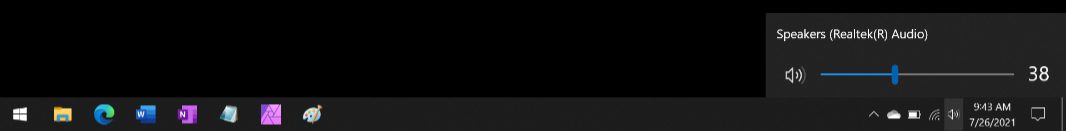
When you select the Action Center button at the far right of the taskbar, you will see a pane with notifications, quick action tiles, and a brightness control.

Chrome OS

When Google designed Chrome OS, it obviously used Windows as an inspiration, especially in the earliest versions, which very closely resembled Windows 7. Today, Chrome OS still features a Windows taskbar-like shelf, and a Start-like interface called Launcher. But the right-most area of the Shelf has evolved over time, and Google now groups a set of status icons—for notifications, networking, battery, and a clock—into a single clickable element that displays the Quick Settings panel.

The Chrome OS Quick Settings panel works a bit like the similar interface in Android, and it, too, will display any available notifications, in this case above Quick Settings. (In Android, they are below Quick Settings.) It’s kind of a combination of the Windows 10 Action Center and the separate status icons for Volume, Network, and Power.

Windows 11

One of the key goals of Windows 11 is to provide a streamlined and simplified user interface. And so the rightmost area of the taskbar is now greatly simplified and is no longer referred to as the notification area. Instead, it’s awkwardly called “the taskbar corner.”

Status icons like OneDrive and third-party apps are still separate, and each still provides its own user interface. But Microsoft has consolidated the system icons, date/time display, and notifications into two new interfaces, called Quick Settings and Notifications.

Quick Settings looks and works much like the Quick Settings interface in Chrome OS, and it is opened by selecting the system icons to the left of the date/time. The keyboard shortcut, which was previously used by Action Center in Windows 10, is WINKEY + A.

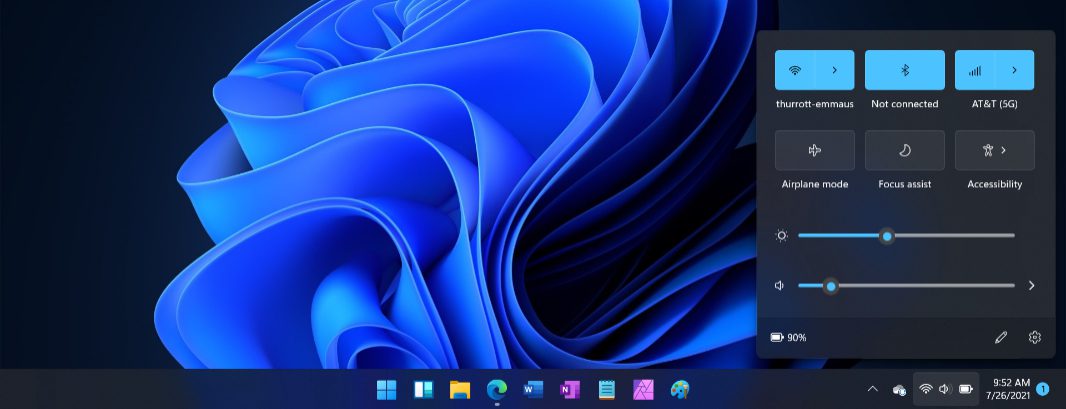
What’s odd is that a normal click (or, with touch, tap) works for all of the system icons; they are selected as a single item. But you can right-click (or long-press) each icon individually to see options related to just that thing. For example, when you right-click the Volume icon, you will see options related only to audio.

You display the Notifications pane by selecting the date/time in the right of the taskbar. Or, by typing the new WINKEY + N keyboard shortcut. This interface displays any pending notifications and, at the bottom, a calendar, similar but less functional than the taskbar-based calendar interface from Windows 10.

The calendar display has changed a few times already during the Windows 11 beta. Currently, it displays the entire current month by default, but you can contract it to provide more space for notifications.

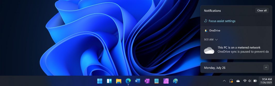
This configuration doesn’t “stick,” however. If you open in later, or after a reboot, it goes back to the default display. I suspect that this will change by the time Windows 11 ships.

Share post

Please check our Community Guidelines before commenting

Conversation 14 comments

  • timo47

    Premium Member
    26 July, 2021 - 12:39 pm

    <p>Paul, I think you got <span style="color: rgb(0, 0, 0);">right-click and left-click mixed up.</span></p><p><br></p><p><span style="color: rgb(0, 0, 0);">So, the new calendar flyout no longer shows your appointments of the day? Then that’s another useful Windows 10 feature they managed to kill. :-(</span></p><p><br></p><p><span style="color: rgb(0, 0, 0);">And I also noticed that the time/clock is also missing. So I assume to possibility to display multiple clocks from multiple timezones has also been removed?</span></p>

    • omen_20

      26 July, 2021 - 1:00 pm

      <p>I can’t believe Outlook hasn’t supported the agenda feature in Windows 10, but then again it also pops up its own outdated alert dialog for appointments. I signed into Calendar but use Outlook with its alerts turned off. Crazy that five years in and Microsoft still can’t support their own OS.</p>

    • adamstaiwan

      26 July, 2021 - 8:32 pm

      <p>Can still see 2 more time zones, but now that the time in the flyout is gone, we are unable to see seconds count.</p>

    • Paul Thurrott

      Premium Member
      27 July, 2021 - 8:53 am

      <p>Belated thanks. Fixed that.</p>

  • omen_20

    26 July, 2021 - 1:02 pm

    <p>I recently got a feedback message for one on one conversations with the dev team about taskbar customization. I wasn’t able to attend, but wish I had. I’m really hoping Windows 11 supports taskbars on the side when it ships.</p>

  • nicholas_kathrein

    26 July, 2021 - 2:47 pm

    <p>This looks much better than Windows 10. I like Chromes look better than Windows 11 but when there is many notifications in chrome they should expend to the left into another column or a centered list of these notifications. Only a few notifications fit with the popped up action center buttons.</p>

  • ghostrider

    26 July, 2021 - 4:04 pm

    <p>It’s clear there’s nothing revolutionary in Win11 – even evolutionary is a stretch. MS just seem to be moving the deckchairs around a bit, but it’s the same ship. In fact, it looks like they’re taking away more than they’re adding, which isn’t good for the power user. Still, it means tech sites have a new stream of articles to publish to try and keep interest in Windows up, and we’ve had a whole bunch of promises from MS about how this version will be the <em>best ever</em>, but I’m sure they said that about every version previous too. Will Win11 be the <em>last version</em> of Windows – I doubt it. Windows is heading to the cloud people, and if you can’t see it, you’re not looking closely enough.</p>

    • singingwolf

      26 July, 2021 - 7:04 pm

      <p>It will also be the safest ever ?</p>

  • CMDV

    Premium Member
    27 July, 2021 - 8:00 am

    <p>Wish they would just simplify to one icon for all Quick Settings and one for Notifications. Revolutionary would be to move Date/Time to old Start location which opens a combined calendar and Widgets menu (above where the icon is located unlike how the Widgets menu opens now). Might actually get people to use/look at the Widgets menu. IMHO Taskbar a bit more balanced then.</p>

    • Paul Thurrott

      Premium Member
      27 July, 2021 - 8:55 am

      <p>I agree. </p><p><br></p><p>The only thing I’d point out, though, is that the 16:9 displays that are far too common now make it hard to see enough info in those panes at one time. Part of it is the new design style, which has bigger visual elements and more whitespace. </p>

      • darkgrayknight

        Premium Member
        27 July, 2021 - 11:15 am

        <p>It was the proliferation of 16:9 displays that made me want to move the taskbar to the side to begin with. </p>

    • hrlngrv

      Premium Member
      29 July, 2021 - 12:01 am

      <p>FWIW, in Linux the MATE panel clock shows weather and completely user-formatted date+time. Having that serve as a button to display a calendar and widgets should be NBD. OTOH, it should be possible to configure taskbar placements as simply as <strong>menu;widgets+|icons|overflow;quickactions</strong>. That is, left|center|right sections separated by <strong>|</strong>, individual bits within each section separated by <strong>;</strong>. Probably way too much like Linux for MSFT to allow.</p><p><br></p><p>That said, is there any good reason the Widgets icon couldn’t reflect the current weather and show today’s actual + next 4 days’ forecasts in a balloon when hovering the mouse pointer over it? If <em>taskbar corner</em> icons can be dynamic, couldn’t pinned icons also be?</p>

  • edlin

    Premium Member
    27 July, 2021 - 5:30 pm

    <p>Honestly, these UI UX changes are only a way to build huge animosity to the business users and the perception of Microsoft being idiotic in their efforts. What is an operating system refresh supposed to provide? A consumer wants innovation in as much as it helps their workflows and efficiency. Microsoft wants to offer ‘opportunity to give a voice’ to the engineering groups, so they feel inclusive. Or so it seems that way after dealing with this crap for 20 years and listening to Windows Weekly for a good portion of it. </p><p>…and so it goes…</p>

    • hrlngrv

      Premium Member
      29 July, 2021 - 12:15 am

      <p>Part of me hopes MSFT’s enterprise customers tell MSFT that it’s time for Windows to be different for Home and Enterprise. Who knows what that does to Pro, but I figure it’d wind up more like Enterprise than Home.</p><p><br></p><p>Another part of me hopes that enterprises having gotten used to the idea of Chrome as the standard browser despite not being bundled with Windows might consider standardizing on non-MSFT desktop shells. Just the serious threat of such a thing might be enough for immediate emptying of MSFT’s metaphorical bowells followed by an urgent refocusing of attention on what it’s most important customers want.</p>

Windows Intelligence In Your Inbox

Sign up for our new free newsletter to get three time-saving tips each Friday

"*" indicates required fields

This field is for validation purposes and should be left unchanged.

Thurrott © 2024 Thurrott LLC