Hands-On: The New Windows 11 Taskbar
- Paul Thurrott
- Jun 02, 2026
-
11
It’s not just the Start menu: Microsoft is also testing a major update to another core Windows 11 feature in the newly updated Windows Insider Program, the Taskbar. And while there’s more to come, most notably in the form of Taskbar-based agents, the changes we see already are perhaps closer to completion than what’s happening with Start.
But first things first.
A brief history of the Windows 11 Taskbar
Like the Start menu, the Taskbar in Windows 11 has always been dramatically simpler than those in previous Windows versions, dating back to the first horribly incomplete release. This was by design, in part, as part of a well-intentioned effort to reduce complexity and introduce a prettier and (literally) centered mobile-inspired look and feel. But it was also vexing for power users and others who relied on certain features that were suddenly missing in the Windows 11 Taskbar, like the ability to move the Taskbar to the left, top, or right edges of the screen and the many options that used to be available in the context menu you saw when you right-clicked the Taskbar in Windows 10, most notably its quick access to Task Manager.
There are reasons why the Taskbar was so dumbed down for Windows 11, including most obviously that it was rewritten from scratch rather than being an updated version of previous Taskbars.
But Microsoft quickly heard that its simplification initiative went t0o far, and with the Taskbar in particular. And
In the early days, one could configure the Taskbar to not be centered by default so that it more closely resembled the UI in Windows 10 by being left-aligned. You could toggle the Search, Task view, and Widgets Taskbar items on or off. And there was an automatic shift to a finger-friendly Taskbar when the user removed a keyboard from a tablet PC or 2-in-1 (that was the source of other, unrelated, complaints about the Tablet mode from Windows 10 being better).
To be fair, Microsoft has updated the Taskbar several times over the past few years, mostly in subtle ways. In the second major release of Windows 11, version 22H2, for example, it added back the ability to drag documents and other files to an app shortcut on the Taskbar to open them, added Taskbar-based window sharing for Teams (and other similar apps), and added the Mute/Unmute microphone button it had promised during the initial Windows 11 announcement. It also later added back the Task Manager link in the context menu, made improvements for multi-display setups, added back icon combining, and provided alternate icon and icon with label views for the Search item.
Then it got weird. Just ahead of Windows 11 version 23H2, Microsoft added Copilot to the Taskbar as a new Taskbar item. And then it spent the next two years moving that icon around, swapping it out for Microsoft 365 Copilot on some PCs, and making other nonsensical “where’s my cheese”-type changes as it tried to figure out an AI strategy that Windows users wouldn’t loathe. It also added features that users did want, like the ability to display the battery percentage next to the battery icon in the tray and made several changes to its date/time and notification bell displays. There’s also a new “End Task” context item you can add for killing as task without needing to open Task Manager.
Aside from the missing Task Manager context menu link, the change that roiled enthusiasts the most was the inability to move the Taskbar to other screen edges. Microsoft repeatedly explained it had no plans to bring back this feature, and for the most obvious reasons: Implementing this change would be complex because the Taskbar was new code and it would have to change how so many other related UIs worked, plus its telemetry showed that very few people moved the Taskbar anyway.
I don’t care about moving the Taskbar to other screen edges, but the one feature I do miss from previous Windows versions is the ability to display the Taskbar in a smaller size, with smaller icons: The Windows 11 Taskbar is too tall, and it takes up too much onscreen real estate. Oddly, Microsoft did add a “Show smaller Taskbar icons” option to Windows 11, but it’s implemented terribly: It makes the icons smaller but it doesn’t make the Taskbar itself smaller. Seriously.

The good news? Microsoft is finally fixing the biggest complaints as part of its focus this year on easing the Windows 11 “pain points” its customers have complained about.
What Microsoft promised for the Taskbar
In March, Microsoft vice president Pavan Davuluri provided details about how the company would improve Windows 11. He said the following specifically about the Taskbar:
The Taskbar will be made more reliable, flexible, and personalized, with more consistent, dependable access to apps and files (together with Start).
Users will be able to customize the Taskbar further, including moving it to the top and sides of the screen and displaying a smaller Taskbar.
Search will be more consistent across Taskbar, Start, File Explorer, and Settings.
Unlike with Start, some of these changes are truly dramatic. Whatever one thinks of repositioning the Taskbar, doing so is a major engineering effort and will require ongoing work as new features and changes come to Windows 11 over time. And the ability to display a small Taskbar? I was using a third-party utility (Start11) to get this after experimenting for many months with hiding the Taskbar to regain some space onscreen. This is a big deal.
And it’s happening now.
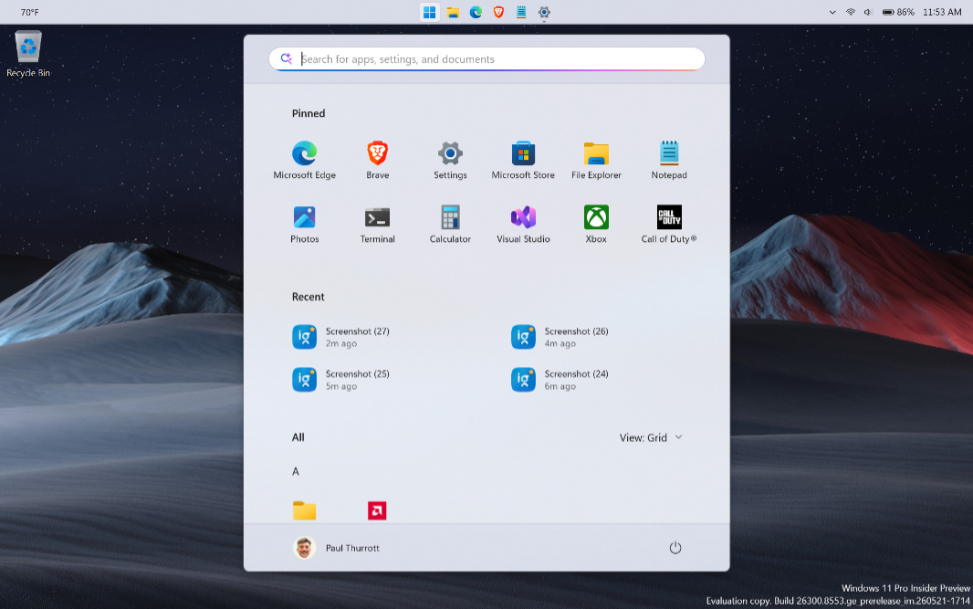
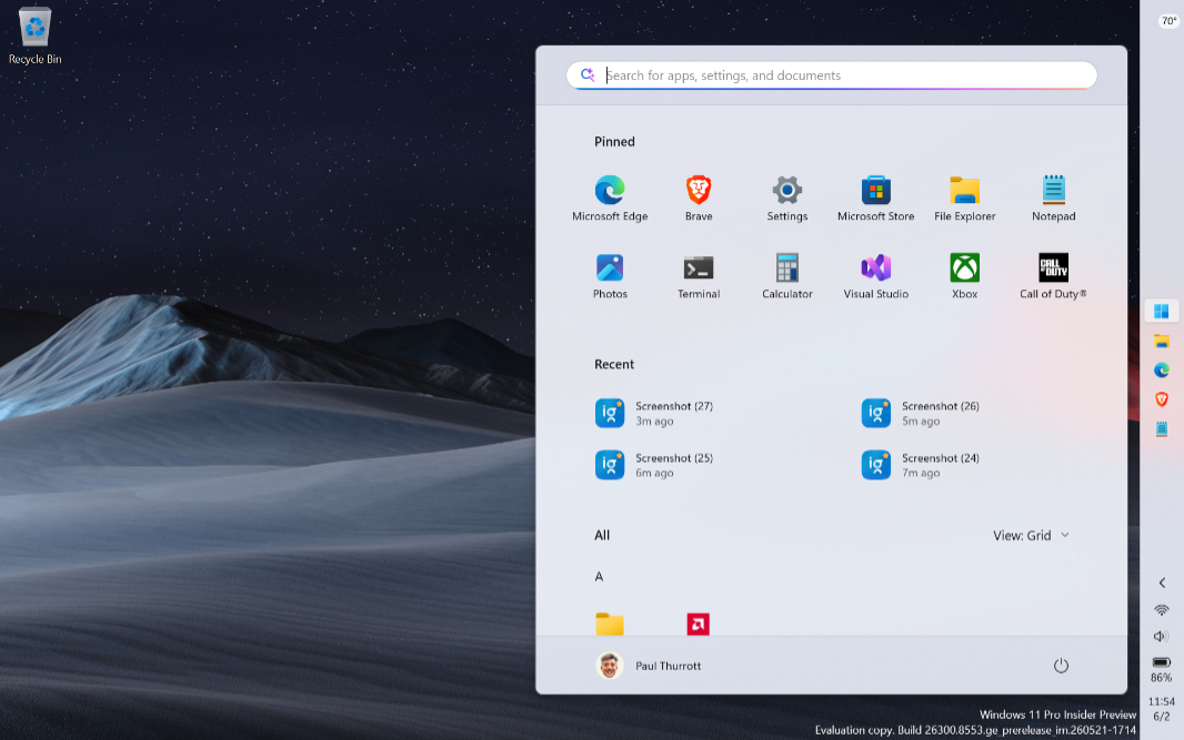
What’s changed so far
The ability to test most of this arrived in late May via a new build for the Experimental channel in the Insider Program that added support for those two big user-facing features, Taskbar repositioning and resizing.
Curiously, when you first boot into the Desktop after this change is installed, there’s nothing to see. The Taskbar looks exactly as it did before, with the same curiously tall UI, large icons, and bottom of the screen positioning.
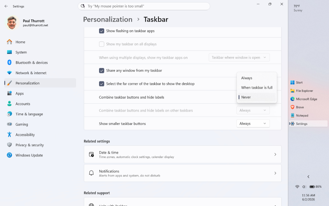
And if you visit Taskbar settings (in Settings > Personalization > Taskbar), it doesn’t appear that anything has changed, major or minor. At first glance, it looks the same as before.
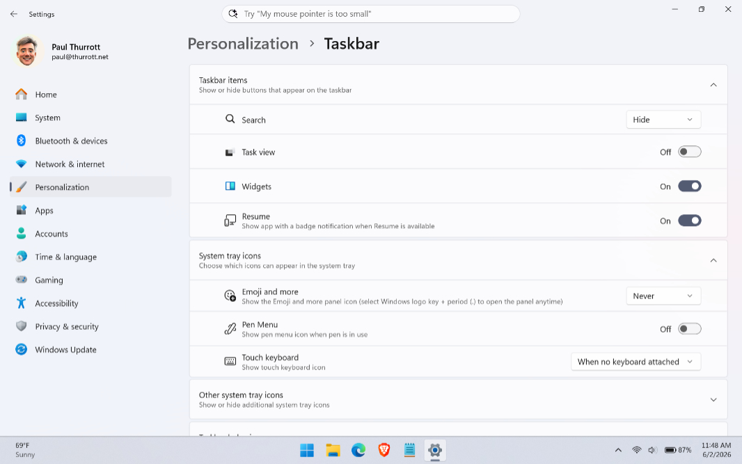
To see what’s new, you have to expand the Taskbar behaviors group. Here, you will see a new Taskbar position option with thumbnails previewing your new positioning choices.
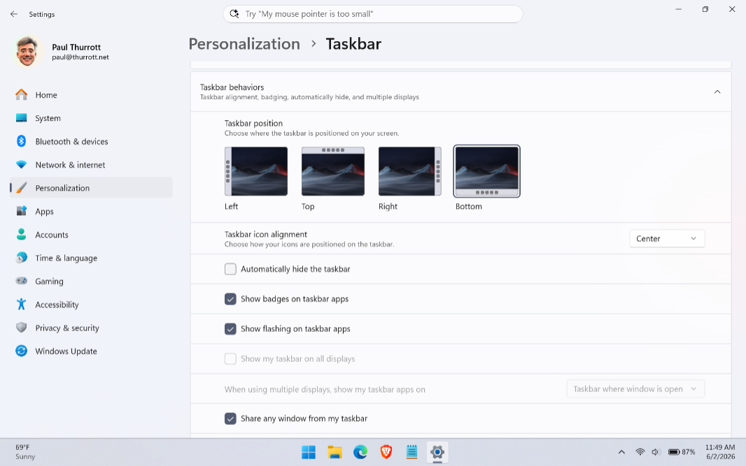
Even less obviously, the “Show smaller taskbar buttons” option doesn’t indicate that anything has changed: You still get the same three choices–Always, When taskbar is full, and Never–as before. But there is a major change here. Now, if you choose Always, the Taskbar and the buttons/icons it displays are both smaller.
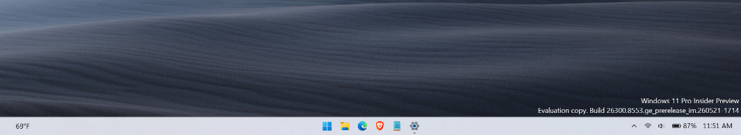
Yes, more resizing options would be nice, we always want more. But this change is excellent.
As for the repositioning options, they work as expected, and UIs that launch off the Taskbar, like Start and Widgets, animate from and appear next to their corresponding Taskbar items correctly. If you place the Taskbar on the top of the screen, for example, it looks like so.
And if you place it on one of the sides, you get a standard Taskbar view if the “Combine taskbar buttons and hide labels” option is set to its default, Always.
But if you change that to Never, you get a centered (by default) take on an age-old Taskbar look. (Again, you can’t arbitrarily resize it.)
This seems to answer the obvious complaints from the community, and it certainly addresses mine. As with the changes happening in Start, this is most welcome.