Hands-On: The New Windows 11 Start Menu
- Paul Thurrott
- Jun 01, 2026
-
4
After ignoring and even undermining the platform for years, Microsoft is racing to improve Windows 11 this year. The most significant changes are coming through the Windows Insider Program first, which makes sense, though it’s not clear when these things will make it to stable. But I previously covered the changes to the Insider Program and Windows Update, and now I can take a look at the Start menu changes Microsoft released last Friday to the Experimental channel.
A brief history of the Windows 11 Start menu
The Windows 11 Start menu, which floats centered above the Taskbar for the first time ever, has its roots in Windows 10X, a failed attempt to modernize Microsoft’s client platform. Leaving aside its original positioning with dual-screen tablets, there were two main components of that modernization, a container-based architecture that would isolate Win32 desktop apps from the rest of the system, and a new mobile-influenced user interface. The former proved too difficult to implement, so only the user interface made it forward to what became Windows 11.
It was controversial from the, ahem, start.
In the initial shipping version of Windows 11 in October 2021, Start was overly simplistic and offered little in the way of customization. There were three main areas in this UI—Search, Pinned, and Recommended—and you couldn’t hide any of them. Worse, if you actually removed all the icons from Pinned, it sat there empty, taking up space. It was pretty, I guess, but it was a terrible design.
In late 2021, Microsoft started testing some customization capabilities, including layout choices like “More pins” and “More recommendations.” These and other minor changes (like folder support in Pinned) shipped in Windows 11 version 22H2, but they didn’t solve the wasted space issue noted above. Start remained unchanged in 23H2 and in 24H2, aside from the introduction of the weird Phone Link “slice”. But then we started getting some concessions. Finally.
Windows 11 version 25H2 introduced a new Start layout with All apps, previously a separate sub-view, now integrated into the main Start UI and configurable with Category, Grid, and List views. But the bigger change was that Start was now responsive, so its size and layout could change depending on the size and pixel density of your PC’s display.
Since that change just occurred, and since Microsoft had moved so slowly to address other complaints about Start in Windows 11, it was reasonable to assume that nothing major would change for the next release either. But then the whole pain points thing went public and, well, here we are.
What Microsoft promised for Start
In March, Microsoft president Pavan Davuluri promised to make specific changes to Windows 11 to address the customer pain points the company had suddenly woken up to. There’s a lot to that, but looking specifically at Start, we were told the following.
This “core Windows surface” would be made “more reliable, flexible and personalized” so that it could be customized in ways that work best for each users.
Start would deliver more consistent and dependable access to apps and files.
The Recommended section would be “more relevant” by surfacing apps and contents you care about most, and it would offer “clear controls to customize the experience or turn it off.”
The Search experience would be more consistent across Start, the Taskbar, File Explorer, and Settings.
Microsoft would improve Start performance and latency by “moving more experiences to WinUI 3,” and we later learned that some sections in Start are written with web technologies like JavaScript that have performance issues with commingled with native code.
Honestly, this isn’t all that dramatic. But as it turns out, there were other changes in store. And though it’s unclear whether all of them will come to Windows 11—including, for example, the ability to arbitrarily resize Start as we could in Windows 10—we are now seeing the first changes via the Insider Program.
What’s changed so far
On Friday, Microsoft issued a new build to the Experimental channel in the Windows Insider Program that includes, among other things, some new Start customization capabilities. These are in addition to the new Taskbar position customization capabilities it added in a previous Experimental build. Which, come to think of it, I never wrote up individually. (I did record an episode of Hands-On Windows about the Taskbar changes, however, that’s not public yet.)
Here’s what’s new.
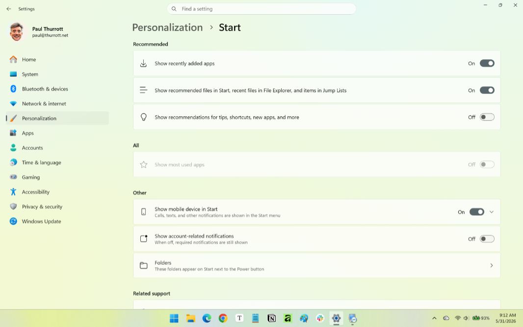
Recent section. The Recommended section of Start has been renamed to Recent. And you can now individually toggle the display of recently added apps, recent and suggested files, and tips and app recommendations on/off as you prefer. (Note: I can’t explain this, but on the PC I used for these shots, the Recent section no longer appears. It’s a beta.)
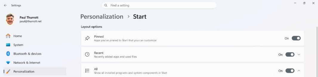
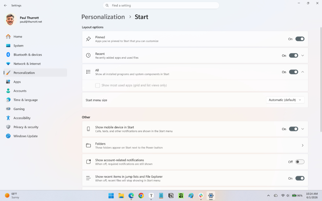
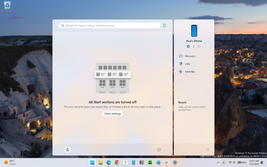
Toggles for Pinned, Recent, and All. Now, you can individually show or hide the three main Start sections—Pinned, Recent, and All—using toggles in Start settings (Settings > Personalization > Start).
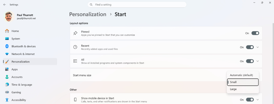
Size options. The layout options in Start settings no longer include a Layouts section with “Default,” “More Pinned,” and “More Recommended” choices because of the changes noted above. But now there’s a new Start menu size section with “Automatic (Default),” “Small,” and “Large” choices. What you see will vary according to your PC: In some cases, the default choice will be the same as choosing Small or Large.
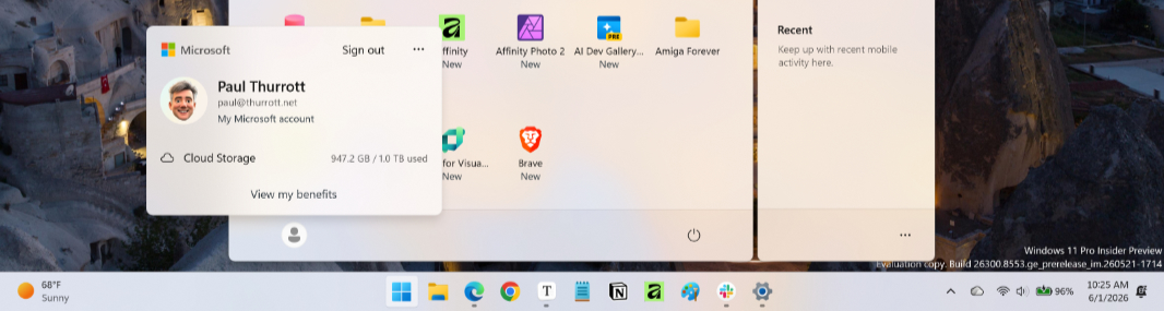
User account profile hiding. Start displays a user account profile button by default that launches a sub-menu of account-related choices most will never need and, unless you disable it, account-related notifications that are often promotional-based. Now, you can hide this button, which includes your name and profile picture, if you’d like. The option, “Hide your name and profile picture,” is easy to miss in the Other section of Start settings. Oddly, if you enable this, the sub-menu still appears when you click the now-empty button.
Start settings. As noted above, Start settings has been redesigned to surface the new options and remove some, like the layouts, that are no longer available. Here’s the old settings interface and then the new version…
Despite all this, the changes are mostly minor in real-world usage terms. I like that everything can be inline now, without Start sub-pages, and I like the “Show more/Show less” toggle on Pinned. The sizing choices are interesting, I guess, though I never had an issue with how much space Start does or does not occupy.
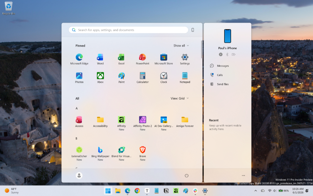
Here’s the Start menu on Default and/or Small sizing:
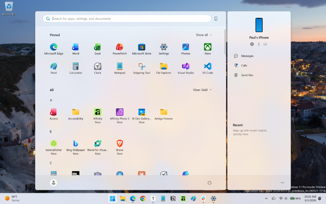
And with Large sizing:
I haven’t tested what happens when you manually delete everything in a section, like all the shortcuts in Pinned, an action that, to date, has resulted in a large empty space. But because you can toggle all three Start sections off easily, I tried that. And … interesting.
Of course, the Start changes aren’t happening in isolation. Microsoft is also changing the Taskbar to include the ability to position it on any screen edge, as you could in Windows 10. And it is going to let us display the Taskbar as a smaller interface, which I very much prefer. (This customization was also available in previous Windows versions.) Taken collectively, these are nice updates. But I’d like to arbitrarily resize and even rescale Start, in the latter case perhaps emulating the “small Taskbar icons” view, but in Start.
There are further adjustments coming, of course. I’m not aware of any changes to Search or performance/latency in Start in this build, for example. But whatever. Improvements are improvements. And these changes are definitely an improvement.