Microsoft Exploring Tweaked Start Menu Design in Windows 10

Microsoft could be introducing new updates to Windows 10’s Start Menu design in the near future. The company recently introduced a new iconography design for Windows 10 that features a really colourful, vibrant look as opposed to the monochrome design we have seen before.

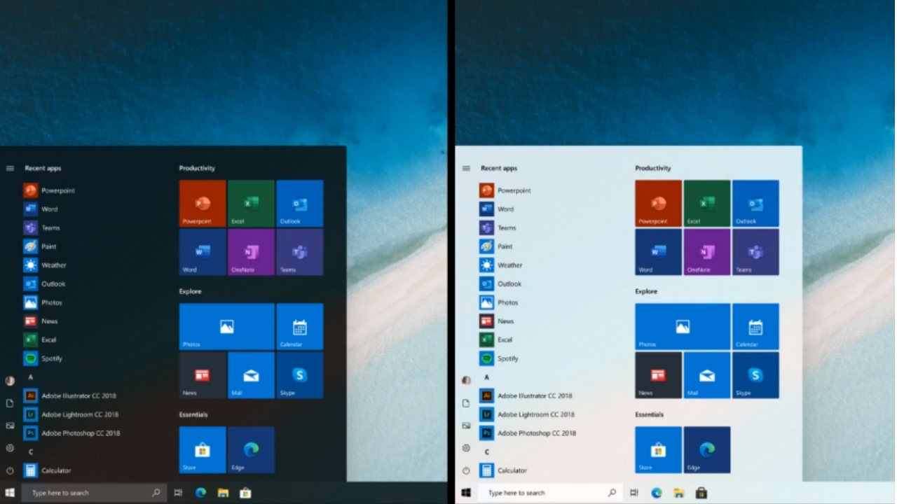
With the new design, the Windows 10 Start Menu does not look its best because of the coloured icons as well as the accent colours on the live tiles. Microsoft is now exploring a new design that could address that problem.

Windows Intelligence In Your Inbox

Sign up for our new free newsletter to get three time-saving tips each Friday — and get free copies of Paul Thurrott's Windows 11 and Windows 10 Field Guides (normally $9.99) as a special welcome gift!

"*" indicates required fields

This field is for validation purposes and should be left unchanged.

[ad unit=’in_content_premium_block’]

In the latest Windows Insider webcast (around 47 min), Microsoft employees showed off screenshots/mockups of a new design the company is exploring for the live tiles. The new design takes away the “chaotic” look of the current design, getting rid of the accent colours for the live tile backgrounds. For comparison, here is how it looks right now:

Microsoft strongly emphasised that this does not mean that the live tiles in Windows 10 are going away. The design the company is exploring, however, will be for when live tiles are turned off. So yes, it seems like Microsoft is slowly making its way towards the death of live tiles, but it’s not ready to do that just yet. The company’s Windows 10X experience completely takes away live tiles, moving to a new design for the Start Menu, and it’s possible Microsoft will slowly be bringing some of that design to the full-blown Windows 10 experience.

Tagged with

Share post

Please check our Community Guidelines before commenting

Conversation 34 comments

  • justme

    Premium Member
    04 March, 2020 - 5:27 am

    <p>Interesting. That said, my preference is still Start10 from Stardock.</p>

    • SvenJ

      04 March, 2020 - 1:17 pm

      <blockquote><a href="#525718"><em>In reply to JustMe:</em></a><em> </em>So, Windows 7.</blockquote><p><br></p>

  • anderb

    Premium Member
    04 March, 2020 - 6:19 am

    <p>Still looks awful. Why can't they just admit they messed up and go back to the Windows 7 design instead of this 'tile that isn't a live tile' nonsense?</p>

    • will

      Premium Member
      04 March, 2020 - 7:21 am

      <blockquote><em><a href="#525719">In reply to anderb:</a></em></blockquote><p>Agreed. Just go with the Window 10X design and move on. The whole new icon design is very odd for a company that was trying to give a more neutral pallet to icons. </p><p><br></p><p>Microsoft changed a bunch of icons and now it seems as if the UI team has to “fix” Windows to match it. It seems like the left and right hands are not talking. </p>

      • dnewkirk

        04 March, 2020 - 8:03 am

        <blockquote><em><a href="#525730">In reply to will:</a></em></blockquote><p>There are enough inconsistencies in the current UI that indeed need to be fixed. That said, the UI of traditional Windows is likely to be permanently stalled, to be replaced by a redesigned WCOS alternative in the future…</p>

  • ghostrider

    04 March, 2020 - 6:55 am

    <p>Live tiles (and tiles in general) are still pointless, and became irrelevant when WM10 was killed off. They look awful at 'normal' size, and at 'small' size, you need to know what icon you're looking for to get a hit. The whole start menu needs a re-think, as most I know resort to pinning to the task bar or use desktop shortcuts.</p>

    • mikes_infl

      04 March, 2020 - 5:25 pm

      <blockquote><a href="#525721"><em>In reply to ghostrider:</em></a><em> The live tiles look really good in "invisible" mode, though.</em></blockquote><p><br></p>

  • 2ilent8cho

    04 March, 2020 - 7:34 am

    <p>Go blow the dust off an old device running Windows 95/98/ME/NT4/2000 and the Start Menu is wonderful and works great. It is even improved on XP/Vista/7 . </p><p><br></p><p>Why can Microsoft not grasp they had the Start Menu perfected years ago and have gone backwards with Windows 10. Even 95's more primitive Start Menu is an improvement on 10's. Users interact via the graphical interface and that interface is still the worst thing in Windows 10. Yeah some bits under the hood may be vastly improved, but its still an ugly, mismatched inconsistent mess, and thats before we even start talking about that atrocious Settings app, pull it and go back to a Windows 2000 style Control Panel. (The simple view in XP/7 was awful, but could be turned off with 1 click re resemble the older style). </p>

    • red.radar

      Premium Member
      04 March, 2020 - 9:42 am

      <blockquote><em><a href="#525743">In reply to 2ilent8cho:</a></em></blockquote><p><br></p><p>control panel inconsistencies are unforgivable. I like where they were heading refreshing the control panel with settings. However they just gave up. If your not going to finish the job and complete the transition then don’t screw around with it in the first place. </p><p><br></p><p>its why I cringe every time they mess with windows. It’s like wondering what barn door they are going to leave open next …</p>

      • Paul Thurrott

        Premium Member
        05 March, 2020 - 7:50 am

        Unforgivable. 🙂

        UI inconsistency is very common in Windows. It’s kind of its thing.

      • Greg Green

        05 March, 2020 - 8:37 am

        <blockquote><em><a href="#525786">In reply to red.radar:</a></em></blockquote><p>The control panel/settings mess is so bad it’s funny. It really does seem like they just gave up. It’s hard to believe the bosses at MS actually use Win 10, otherwise how can they not see this? Or do they just call IT when something goes wrong with their PC?</p>

  • rm

    04 March, 2020 - 8:15 am

    <p>Are the screen shots in this article reversed, because I am on Win 10 Ent version 1803 and my tiles have different background colors. I am guessing they are removing the different background colors as we see in the first screen shot. I think the tiles are becoming shortcuts again with an area around them that act as part of the icon when touched. Basically enlarging the icon for touch without increasing the icon size. There are a lot of touch screens out there, so to me this makes since and it gets them closer to Win10X.</p>

  • André Kittler

    04 March, 2020 - 8:23 am

    <p>Windows 7 was wonderful. In all the UI AND the best start menu. Sad that they will never admit it. </p><p>So lets keep changing. For years to come. Maybe one day something good will happen, who knows…</p>

    • codymesh

      05 March, 2020 - 1:29 am

      <blockquote><em><a href="#525752">In reply to Andre_Kittler:</a></em></blockquote><p>disagree</p>

  • red77star

    04 March, 2020 - 9:26 am

    <p>It is a still failure from design point of view in other words looks like pile of crap compared to Windows 7 / Vista start menu, not to mention its usability being terrible. Frankly Windows 7 UI is worse than Vista. In 2007 Microsoft perfected UI with Vista especially Start Menu. People use classic shell or start10 to replace this abomination among other UI elements in Windows 10. </p><p><br></p><p>But if we really want to go that far, Windows 2000 had the most usable and best interface ever and it is the best Windows OS by far. Microsoft is trying to make Windows 10 smaller and yet Windows 2000 would fit into 350Mb media and still be more functional than Windows 10. While we are on that subject, .NET should get the f. out of Windows. I make a living on it but that bloatware has no place to be in OS. </p>

  • red.radar

    Premium Member
    04 March, 2020 - 9:26 am

    <p>Typical Big Corp PR…. let’s ignore the glaring issues and Grab the lipstick… </p><p><br></p>

  • tbtalbot

    Premium Member
    04 March, 2020 - 9:41 am

    <p>Don't like it. I use the full screen menu with large tiles for separate email accounts &amp; calendar, that with smart tiles for certain apps turns my screen into a great situational awareness tool. The problem isn't the tiles or the live-tiles, it is that very few know how to set them up. Microsoft should have a setup option for one of several well vetted design patterns. Turning tiles back into little icons (which this is the pathway to) is the wrong direction in my opinion and the eventual result will be no different from iOS or Android.</p>

  • slbailey1

    04 March, 2020 - 9:51 am

    <p>I did not know that you can turn live tiles off! How do you do that? </p>

    • thejoefin

      Premium Member
      04 March, 2020 - 1:00 pm

      <blockquote><em><a href="#525787">In reply to slbailey1:</a></em></blockquote><p>Right click on them &gt; More &gt; Turn Live Tile Off</p>

    • anoldamigauser

      Premium Member
      04 March, 2020 - 1:01 pm

      <blockquote><em><a href="#525787">In reply to slbailey1:</a></em></blockquote><p>Right-click, choose "More &gt;", then "Turn Live Tile off".</p>

  • winmaciek

    04 March, 2020 - 9:57 am

    <p>Honestly, I don’t mind current start menu design at all. I use live tiles (particularly the one that’s showing me latest RSS feeds). I sometimes even use the full screen menu on a non-touch laptop – it looks OK. I don’t mind it, because I rarely launch apps by browsing start menu. The ones I use very often are pinned to task bar, little less frequent ones as tiles and the rest is usually launched by hitting Windows key and typing, just like spotlight on macOS. Much faster than picking it manually from the list. </p><p>Also, Windows 7 required an extra click to get to the list of apps whereas in Windows 10 I can start scrolling right away. </p><p>And no, Windows XP/2000/older wasn’t better. </p>

  • glenn8878

    04 March, 2020 - 10:34 am

    <p>Live Tiles were one time promising when Windows had a mobile strategy. Tablet mode no longer exists. They need to dump tiles for desktop computers. It no longer serves a purpose. Also, fiddling around with the tiles makes no sense if live tiles goes away. We are back to icons on the desktop. Why even have icons on a Start Menu? Maybe have a Frequently Used icons without tiles on the right to solve this problem. </p><p><br></p><p>Tablet mode should not go away when you have a yoga style laptop or Surface Pro. I just wish they will fix the interface to work better as a mobile device with better designed applications as apps.</p>

    • datameister

      04 March, 2020 - 1:23 pm

      <blockquote><em><a href="#525792">In reply to glenn8878:</a></em></blockquote><p><br></p><p>One thing I wish they would have tried, is pinning a live tiles to the desktop. That would have made certain tiles more useful. Maybe they were afraid it would be too much like Android or something?</p>

      • glenn8878

        04 March, 2020 - 2:35 pm

        <blockquote><em><a href="#525826">In reply to DataMeister:</a></em></blockquote><p>Windows had Gadgets, Sidebar, Widgets before. I doubt they will revisit it with Tiles. It will be comical like Clippy.</p>

  • james_rainey

    04 March, 2020 - 11:11 am

    <p>Giving users choices is a hallmark of Microsoft and Windows. This isn't broken, so changing it is fine if they introduce improvements to an existing model. And, maybe they leave some options in place for users who will be vocal about any kind of change. If not, so be it. Just don't change something for the sake of change (e.g. new icons?).</p>

  • Cdorf

    Premium Member
    04 March, 2020 - 11:43 am

    <p>I must say my absolute favorite live tiles — the ones I use are Weather and Photos. I love seeing a random photo of my kids when I open start </p>

  • datameister

    04 March, 2020 - 1:21 pm

    <p>This is a good move, but they could have just hired me to filter out the junky designs and we could have skipped over most of the bad decisions.</p><p><br></p><p>Unless they are doing this on purpose. Changing things to look junky or cluttered just so they can later change it to something nice and have a greater contrast in the improvements. </p>

    • Greg Green

      05 March, 2020 - 8:34 am

      <blockquote><em><a href="#525823">In reply to DataMeister:</a></em></blockquote><p>MS would be better off going to a local art school, donating a Studio or two and giving out surfaces to the students who could come up with the best icons and designs. This constant hand waving and pixel shuffling by MS is absurd.</p>

  • qaelith2112

    04 March, 2020 - 2:31 pm

    <p>What have I missed in the photos? The "tweaked design" looks identical to me, other than the background changing to white and the labels changing to black on the start panel. Is that it? </p>

    • Paul Thurrott

      Premium Member
      05 March, 2020 - 7:44 am

      Yeah. That’s it. This is nothing.

  • Scsekaran

    04 March, 2020 - 3:44 pm

    <p>I use Live tiles every day . Mail, Calendar, Weather, Battery life, Cellular data and news reader/RSS reader. You get the information at a glance. That's all I need most of the time. Mail is not consistent and To Do is not consistent either. They should improve the functionality and give options for people who want to use it.</p><p><br></p><p>Apple also introduced live tiles in ipados for weather, stocks</p>

  • TroyTruax

    04 March, 2020 - 7:36 pm

    <p>I removed all the live titles and reduced the start menu window area to only display the app list. I have all the programs that I use regularly pinned to the task bar so I don't actually pop open the start menu very often.</p>

  • Jim Lewis

    04 March, 2020 - 9:22 pm

    <p>A Live Tile is or could be essentially just a widget constrained to a certain style. I make my Start Screen full screen and visit it frequently (hitting the Windows key is really challenging for some, I guess). I like the at-a-glance availability of info for e-mail, news, weather, upcoming calendar events, tasks (when 2Day was alive), etc. Unlike the icons on the Windows desktop that frequently get rearranged by various Windows "accidents," screen display changes, etc., my Live Tiles are always "just where I left them." Where is all the howling about widgets in Android? And Microsoft Launcher for Android essentially encourages users to incorporate widgets into the Glance Screen – isn't that equivalent to the Start Screen in Windows-some "out-of-the-way" place that you have to go to?! The Android widgets are typically scattered across multiple screens whereas in Windows, you can have all your "widgets" in one place on a big screen monitor such as I am typically working with. Microsoft a la Android widgets should encourage developers to make Live Tile displays more user-tunable and also work on allowing the display of additional (tunable) information display with mouse cursor or pen hover over a Live Tile (without having to launch the app). Several years back there was video from an Asian branch of Microsoft displaying such capability, which I thought would be really useful. Perhaps the problem is that Live Tiles are a complication for Windows Lite so Microsoft would rather offer "normal" users a simple and dumb OS but if Windows is becoming modular, it would be nice if one has the computer to handle it, to add more components as one wishes if one has the computing power to support more complexity.</p>

  • maelstrom

    04 March, 2020 - 9:35 pm

    <p>The problem is the tiles are not conforming to the selected accent color. The new icons selecting their own tile color just doesn't make sense.</p><p><br></p><p>For instance, News is red, Finance is green like the Translator app. The Alarm, Mail &amp; Calendar apps now appear on a blue tile (instead of the user-selected accent color) which appears to be the same blue as Skype but a different blue than OneDrive! That's worse than ever and quite a bit silly too.</p>

Windows Intelligence In Your Inbox

Sign up for our new free newsletter to get three time-saving tips each Friday

"*" indicates required fields

This field is for validation purposes and should be left unchanged.

Thurrott © 2024 Thurrott LLC