A Deeper Dive into macOS 26 (Premium)
- Paul Thurrott
- Jun 16, 2025
-
10
Last year, I reviewed the MacBook Air 15-inch M3 ahead of the first wave of Snapdragon X-based Copilot+ PCs for comparison purposes. I’ve owned more Macs than I can count, but I wanted to get the mainstream Mac laptop that Microsoft and Qualcomm were targeting. And it was impressive across the board. (Still is.) The performance, battery life, form factor, the whole thing.
Flash forward a year and Apple has announced macOS 26 alongside its other Liquid Glass-based OS updates. I’ve installed these betas on my MacBook Air, iPhone, iPad, Apple TV, and Apple Watch. But I wasn’t sure how to handle the Mac at first. After a bit of back and forth, I decided it was time to just start over and look at Tahoe with fresh eyes.
A macOS multitasking recap
I had a few nitpicks with the MacBook Air last year. My only major issue was related to macOS and its inconsistent multitasking capabilities. In fact, this topic was so vexing, I wrote about it a month before I published my review, differentiating between subjective quirks and the inconsistent interfaces that are objectively worse because they hinder productivity.
In macOS, apps can support an elegant full-screen mode in which each runs in its own space (virtual desktop) and you can swipe between them using three fingers in a horizontal motion with the Mac’s touchpad. Unfortunately, full-screen apps don’t occupy the full screen; there’s an empty black bar at the top and/or the menu bar, depending on how you configure the latter. I suspect this is to accommodate the notch on modern Macs like my Air, but I wish I could override this behavior. Full-screen apps should be full-screen. I’m sure some media apps can do this, but none of the apps I daily can.
That touchpad-based navigation swipe works really well. But because it’s limited to spaces, there is a divide between apps floating over the desktop in Finder and those running full-screen. If you’re a Windows user and your brain just fired up an old memory, it’s likely because that’s how Windows 8 worked: The Desktop appeared as if it were its own full-screen app.
What this means is that you can’t reach every app using that swipe. You can only swipe between full-screen apps (which are each in a space) and whatever is over the desktop, collectively (all of which are also in a space, called Desktop). Once you’re there, you have to use Command + Tab, the macOS version of Alt + Tab, to switch between running apps. (You can also access full-screen apps this way.)
And that’s OK, I guess. I can remember two different things. It’s just that macOS face-plants when it comes to apps with multiple windows. In Windows, each app window gets its own position in the Alt + Tab list. But in macOS, they do not. Those positions represent apps, and if an app has multiple windows, you have to use whatever options it offers for switching between them. There is a Command + ` shortcut you may want to learn if you aspire to be a Mac power user, for example. But now we’re up to three somewhat different ways to do things, and none of them do everything.
That’s inconsistent and, to my mind, objectively more complex–and, thus, worse–than the system in Windows 11. But we’re not done. And that’s because macOS also supports a feature called Stage Manager that puts angled thumbnails of recently used apps on the left side of the screen while the app window you’re working in can be laid out over an empty desktop in a sort of focus mode. Stage Manager only appears when you’re on the Desktop (space), so you can’t use it in full-screen mode. It’s an interface for what Apple calls “traditional windows” only, and it works with the Command + Tab keyboard shortcut.
And at the time I wrote about macOS multitasking last year, the platform only supported a limited way to “snap” two windows in a side-by-side Split View mode (oddly also reminiscent of Windows 8), and there was no keyboard shortcut for that.
Fixing macOS multitasking
In the couple of months I used the MacBook Air before writing the review, I stuck to the software Apple provided so that I could move past my basic understanding of how it worked and really get used to it. And I did. But I also knew that there was a thriving market for free and paid utilities that help Mac users overcome whatever issues. And that the issues I had raised would surely have generated some solutions.
This was the case. And so I got a few utilities to make Mac multitasking more consistent and usable.
Alttab. This free app lets you use Command + Tab to switch between all open windows, not just top-level apps.
Magnet. This $5 app brings Windows Snap-like functionality to the Mac, with keyboard shortcuts and multiple layout options.
Parallels Desktop. This is a sort of “nuke it from orbit” approach since it costs money (and every year, too, since it’s expensive), and it uses a lot of system resources, but you can of course run Windows 11 on Arm in a virtual machine to access the apps or features that are missing in macOS. But it works well, and you can even configure it to run Windows apps in standalone windows alongside your Mac apps.
And that’s been my Mac experience for the past year. Mostly stock, mostly the same apps I use in Windows, but with a few additions to ease the rough edges.
So what about macOS Tahoe?
Going back to my WWDC 2026 overview and thinking about this after a bit of time has passed, it’s clear that the iPad multitasking improvements in iPadOS 26 were the star of the show in my eyes, the single biggest change Apple has made across its platforms. But there were other big announcements related to iOS 26, which will finally offer integrated call and message spam protections. And to the Mac, which picks up the Liquid Glass user interface alongside Apple’s other platforms, and some other visual tweaks. But also some features aimed at decidedly power users.
This was more subtle than the explosive iPad advances, a change so dramatic that it will be debated by pundits for years. But in rewatching the WWDC 2025 keynote repeatedly, I am struck by how overt this really is. With the iPad evolving to be what Steve Jobs always wanted, at least in spirit, a personal computer as adept at creation as it is at consumption, the Mac is likewise evolving. It is becoming more of what we used to call a workstation. It is the truck to the iPad’s car, if you will.
That doesn’t mean it can’t be pretty: With Liquid Glass, the design possibilities expand dramatically, with a full range of minimalist and maximalist options that should please almost anyone. It also doesn’t mean there isn’t hand-waving going on, as evidenced by the newly transparent menu bar that still haunts the top of my screen using up space that is unavailable to apps. I can either see that (and see the time, which I do like) or I can see a blank black bar. I guess that’s a choice.
And it doesn’t mean it can’t have mainstream features any Apple users expects, like the Phone app (finally) and Live Activities integration. These are what I call “bread and butter” solutions because they are so core, in this case, to Apples’ cross-device ecosystem experiences. Something I was reminded of just yesterday, as noted (far) below in the Father’s Day bit at the end.
No, what I’m referring to are features like the powerful new Spotlight and improved Shortcuts. The former is more familiar: Just type Command + Space and type what you want. But the latter is as unfamiliar to most Mac users, I bet, as is the Power Automate app that Microsoft bundles with Windows 11. Which I mention in part because they offer the same basic functionality, though what Apple is doing with Shortcuts is also reminiscent of the new App Actions in Windows 11, part of the ongoing AI-ification we see over there.
The Mac is also what developers use to create apps and services that run on Apple’s devices or within the ecosystem. Xcode (pretty much) only runs on the Mac. Even if you figure out a cross-platform solution for the software you create, like .NET MAUI or Flutter, you’ll need a Mac if you intend to publish your work to the App Store.
I initially upgraded my MacBook Air from whatever macOS Sequoia version I was running to the first macOS 26 Tahoe developer beta the day it was announced, last Monday. And I was curious that there wasn’t any attempt to push me into Liquid Glass or whatever. But as I’ve done on my iPhone and iPad, I kept going back and forth between different appearance (Light, Dark, and auto modes) and icon/widget styles (Default, Dark, Clear, and Tinted.) And I started wondering about the basics of the system and bow it differed from the iPad with its newly capable iPadOS 26. And I started thinking about pushing reset on this thing and doing a clean install. Which is what I did.
Starting fresh with Tahoe
I mentioned this somewhere, but we kind of give Apple a pass when it comes to all the software it preloads on all its devices, in the same way that we heavily criticize Samsung for doing the same, albeit less elegantly. But it is striking to me how many Apple apps there are in macOS these days. Which you can get a hint of, just looking at the default Dock.
That’s just the tip of the iceberg. For example, Pages, Numbers, and Keynote are not in the Dock by default, which is kind of curious given the nature of the device and how full-featured those apps are.
It’s also curious to me that you can’t delete some pre-bundled apps that seem superfluous to me, at least not easily. For example, when I drag Journal, Image Playground, and many other Apple apps to the Trashcan in the Dock, nothing happens. (This is the kind of thing we also criticize Samsung for. And I’m sure some Mac fan will point out how I could delete those apps. There’s always a way.)
Mostly subtle at first glance
OK, whatever. That’s no different from previous macOS versions. The changes I noticed in Tahoe were, as noted before, subtle. The transparent menu bar. And then the sidebar in Finder windows, which can be more or less prominent than before, depending on how you later configure the look and feel. But it’s not until you explicitly configure the Appearance settings to be anything other than the default.
![]()
As with Apple’s devices, the effect varies. I like having an Auto appearance setting that chooses Light mode during the day on Dark mode at night; this is familiar from mobile platforms, but it’s something Windows 11 lacks. (This is not new to Tahoe.) I feel like a Clear icon and widget style, set to Auto so that it’s light during the day and dark at night, might be the ideal distraction-free configuration. We’ll see.
Mostly the same multitasking features
From a multitasking perspective, the basics are the same as before, meaning that there are inconsistencies between full-screen apps and traditional apps. Stage Manager is off by default, so I left that alone. But there is one change that Apple ties to Liquid Glass and is also available on the iPad: You can click and hold on (or mouse over) the green Full screen window button and a Snap-like menu appears with multiple window options.
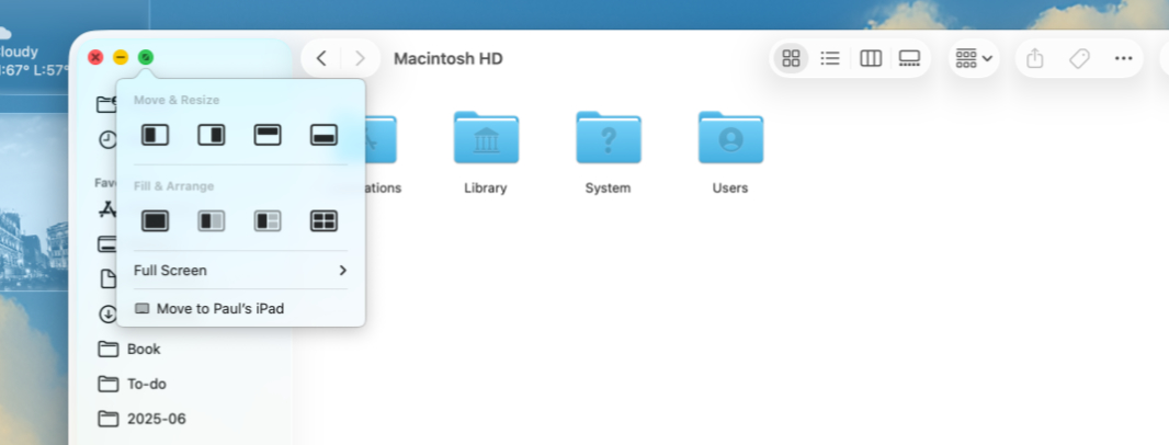
This lets you snap the window to two or three areas, or four corners, instead of just two. And also go full-screen. My snapping needs are light, but this is better than before, and I guess it obviates the need for Magnet, at least in my case. I’m tempted to just install alttab again, but I suppose I can live with this system as-is. And Mission Control, which you reach with a three-finger swipe upwards on the touchpad, mostly solves the issue of getting to additional windows.
Spotlight and Shortcuts are the real stars here
Spotlight and Shortcuts will need more time.
I’ve always loved Spotlight. Part of it is my desire to keep my hands on the keyboard. So where I can tap Start and then type the beginning of the name of an app to launch an app in Windows, I can similarly type Command + Space and then type the beginning of the name of an app to launch it on the Mac. It’s just a more minimalist UI. And it’s so well-liked that it’s copied by any number of utilities on various platforms. The most obvious (to me) being PowerToys Run (and it’s recent and more extensible replacement, Command Palette) on Windows.
With Tahoe, Spotlight is leaning into a new platform construct called Actions that’s tied to app extensibility/automation capabilities and is, again, reminiscent of App Actions in Windows. You can assign quick keys, short keyboard sequences, that make launching apps or performing other actions even more quickly. You can type Command + 1, 2, 3, or 4 to focus Spotlight on Apps, Files, Actions, or the new multi-item Clipboard.
Spotlight can open shortcuts you create in Shortcuts, of course. But you can also automate shortcuts to run at specific times or in response to specific actions. For example, you might create a shortcut that fires whenever you save a file to a specific folder.
This is old news to some Apple users, I know. But otherwise, it’s a bit of a revelation to learn that, for example, shortcuts can reach inside apps in a way that is reminiscent of what Microsoft used to call deep links in Windows Phone. (There is a bit of this in Windows 11, too, and maybe more on the way with App Actions. For example, you can get a link to any option in Settings and access it programmatically.) It’s powerful stuff but I’m just starting out here, so I will keep it simple.
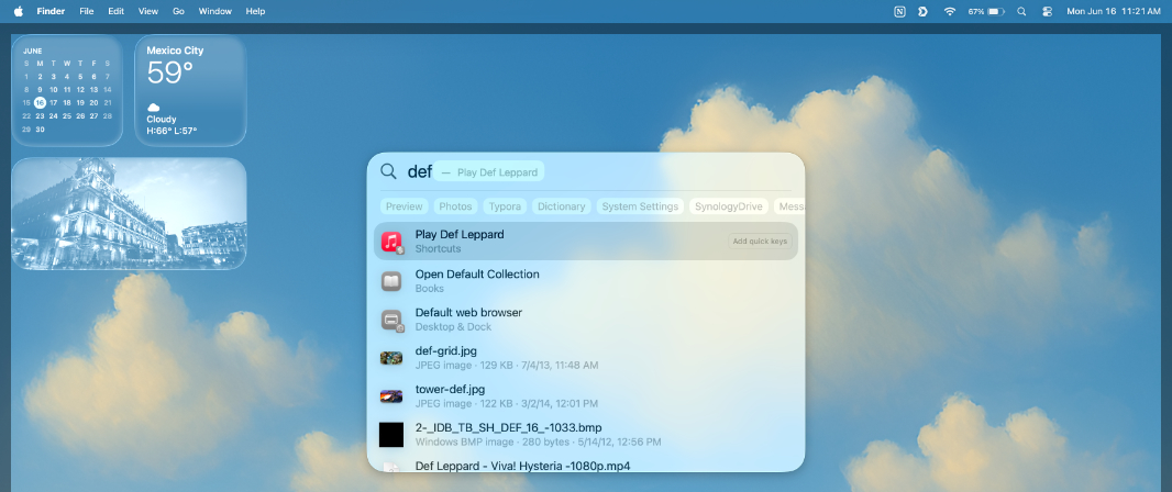
The Shortcuts app provides a few sample shortcuts, but I was curious about the new capabilities. Out of the box, if you open Spotlight and type Play Def Leppard, the results are a bit lackluster. There’s a single link to one song by that band at the top, a few web links, and then options to search iCloud Drive or the web. Eh.
But Shortcuts lets you create a new shortcut and then search for “music” across all actions. This gives you a long list of possibilities, like “Find Music,” “Play Music,” “Add to Playlist,” and many more. So I chose “Play Music,” which put a Play Music item in a flowchart-like layout. Clicking the word Music, I could choose which music I wanted.
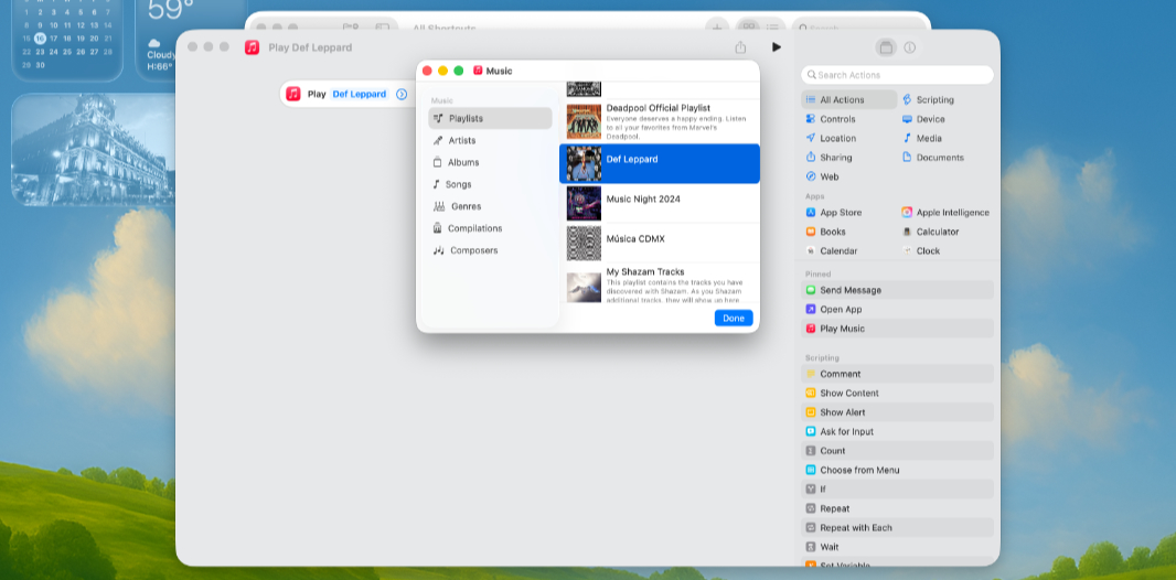
Here, you can choose between Playlists, Artists, Albums, and the like, as expected. I was looking for a playlist I’d made, so finding that was straightforward. This changed the Play Music action to Play Def Leppard, in that case meaning the playlist of that name. And then I could test the shortcut by clicking the Run button. Apple Music popped up, navigated to that playlist, and … didn’t start playing it. So I went back to Shortcuts and made two changes. I renamed the shortcut from Play Music to Play Def Leppard. And I edited it to shuffle the songs.
With that done, I could run the Shortcut from Spotlight: I just type Play Def and tap Enter, Apple Music runs (if necessary), and music starts playing.
Again, this will need more time. But this seems powerful to me.
Xcode, SwiftUI, and app development
I also spent a bit of time last night getting the new version of Apple’s integrated developer environment (IDE), called Xcode 26, installed. And also the new Icon Composer app it showed off at WWDC. I installed all the components needed for Mac, iPhone, iPad, and Apple Watch apps. And then checked out the Apple Developer website to see what was available for those just getting started. And I was happy to see there’s quite a bit.
Apple’s modern app framework is called SwiftUI. This is a declarative environment, similar in some ways to XAML, the XML-based markup language that developers use to create user interfaces in .NET and other Microsoft environments. But it has more in common with Flutter, because you use the same underlying language–in this case, Swift, but with Flutter, it’s Dart–to create both the user interface and write program logic. With XAML, you are typically coding logic in C#.
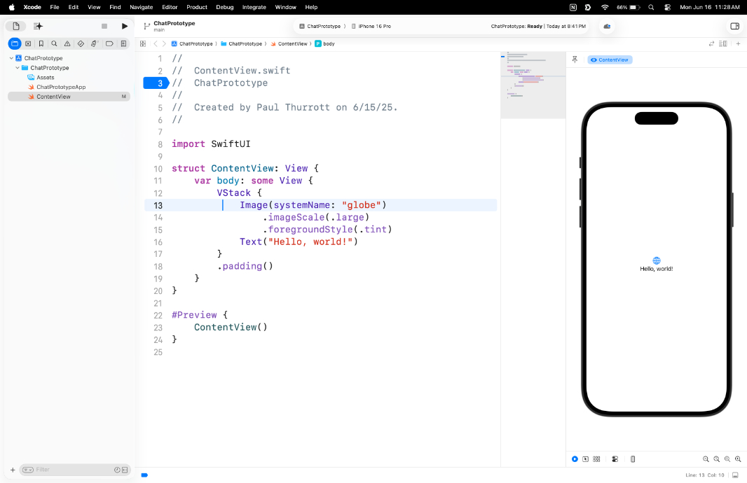
I don’t know Swift or SwiftUI, but I know it’s sophisticated and modern, powerful and yet relatively simple, and the code looks readable. SwiftUI uses an indenting style that looks a lot like Dart/Flutter to me, that highlights the hierarchy of the app elements. This will take a lot of time. But to start, I’ll work my way through Apple’s SwiftUI Pathway and see how that goes. I was not a fan of Xcode or Objective-C in the past, so I’m curious to how it’s changed in more recent years.
Time will tell
I wrote this in my WWDC 2026 overview, but I feel like the updates we see in macOS are respectful to both the platform itself, which is a legacy desktop environment mature enough to not need major changes, and to the audience that relies on it. This is something we do not experience with Windows 11, and it hurts. There are still things I very much prefer when using Windows 11, things I miss when I’m on the Mac. But I get it. I get why someone would go in this direction, and how magical it gets the more they buy into the Apple ecosystem.
And I had a nice reminder of that fact just yesterday. My wife had scheduled a call with the kids for Father’s Day, and as is so often the case, I wasn’t sure how I wanted to make that call in the minutes leading up to the start time. With less than 5 minutes to go, I was lying on the bed, having been half-heartedly playing Call of Duty on a laptop while I configured Tahoe on the Mac. And so I decided to just do the call on the Mac.
I could have just used the built-in webcam and microphones. That would have been easier, of course. But instead, I decided to throw a wrench into the wheel of forward progress. Two wrenches.
First, I walked over to my office to see whether I could find the Belkin doohickey I had purchased last year so I could mount my iPhone on my MacBook Air’s display lid and use it as a webcam. I did find it, it’s called a Belkin iPhone Mount with MagSafe for Mac Notebooks, and it’s completely unnecessary, but what the heck.
Then, I fished my AirPods Pro 2 earbuds out of a travel bag. I hadn’t used them since I switched to the Samsung Galaxy S25+, so I wasn’t even sure if they were charged.
And then, with maybe 60 seconds to spare, I decided to try and use both with this MacBook Air, which I’ll remind you I had completely reset and was still configuring. I had signed in to my Apple Account, so it had that. I figured, what the heck. If any of these fails, the built-in webcam and microphones would work.
I mounted the iPhone on the doohickey on the top of the display lid, and with the rear cameras facing towards me. I put the AirPods Pro 2s in my ears. I clicked on the link to the Zoom call in my calendar. And then I saw that my iPhone was already selected as my camera. And that the Airpods were already selected for the speakers and the microphone. It just … worked. Immediately. With no pop-ups, notifications, or even configurations of any kind.
These are not seismic achievements, I know that. But personal technology often feels like one defeat after another, where nothing ever works right or something that was just working fine suddenly stops working for no discernable reason. When things work, it can feel miraculous. This is especially true when the reverse is the norm.
And so this, to me, was a victory. It was vaguely distracting, I think I zoned out a bit during the first minute of the call. It almost felt wrong. Surely, some part of this should have failed. This is the mindset of a Windows user, folks. Sorry. But it’s true.
So we’ll see. I’m not switching to the Mac anytime soon, and probably not ever. But these kinds of experiences are why I have such great empathy–and perhaps even admiration–for those who do. As noted, I get it.

Gain unlimited access to Premium articles.
With technology shaping our everyday lives, how could we not dig deeper?
Thurrott Premium delivers an honest and thorough perspective about the technologies we use and rely on everyday. Discover deeper content as a Premium member.